Wednesday, 12 December 2012

OUGD405: Design Process - Photoshop - Postcard Task


Based on my research post, I've been experimenting into apature shapes, to manipulate lights which are out of focus, creating my chosen shape, the triangle. You can see below that I've created a lens cap, with a triangle cut out in it, much like the one which you can see on my design context blog. 


Above you can see the lens a cap and a text image, which I created by turning the back light up on my keyboard, on my MacBook Pro, and turning out all the other lights in the room to make them more prominent. I hope to apply this in some images which I will take around LCA before the semester is over, on the 14th.


Above is an example of one of the few photos I've taken today, prior to my camera dying on me, as you can see i've applied the bokeh technique, and created some wonderful images with the light manipulation. However, without anything in focus, in the foreground, the images look rather unprofessional  in my opinion - like I'm unable to focus a camera properly. So, I intend to find something which I can put in the foreground of my images, to give a subject, which would be the main focus of the postcard. However, these would be in the background, or foreground, of the image to keep the theme of 'the triangle'.

Prior to this, I also had taken some photographs around college, which will also be used in this task, you can see them below in the contact sheet provided.


Using this, and my research on some very simplistic, minimalistic postcard designs, I began to make the postcards, for print. I used the method seen in the bottom of another Photoshop Workshop post.


This is the back side of all my postcards, I found this works better, and keeps the postcards as a set, rather than random images collected together. I also think that the bokeh works very well in a low opacity, and adds a nice warming touch to the back of the postcard. To the left of the image, there is a black grey space for the person whom would be sending the postcard to write, or draw, whatever pleases them. Overlaying the bokeh image are 5 lines for the address and a 20x25mm box, for a stamp.

Above, in contact-sheet form, you can see the five images I've selected for the front of the postcard. I used the same grey for the back of the card as a boarder for the front of the card, which i created using a  grey overlay, and then vector masking the part of the image which I wished to be transparent, allowing the photograph to show through. 


Tuesday, 11 December 2012

OUGD404: Design Principles - Creating Accents With Type

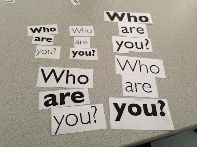
For this part of the module, we were asked to modify the question, "Who Are You?" by manipulating letter forms to convey the feeling of an accent, this could be done by changing the weight, point size and fonts within the typeface. This would exaggerate the prominence of the pronunciation of the letters, which would convey the feeling of an accent. We were asked to create the following accents.

  • Geordie 
  •  Welsh 
  •  Yorkshire  
  •  Irish  
  •  Pirate 
  •  Essex 
  •  Scouse 
  • Jamaican 
  •  Russian 
  •  French 
  •  Australian 
You can see the results of my work in this issuu publication:


In Session:

In the session, we were placed into groups of 3 or 4. We were then asked to switch tables, giving us the "Who are you?"'s of another group. These were not labeled, so we could not tell which sentence belonged to which accent. We were then asked to categorise the sentences into their appropriate accent piles. This was rather difficult at times, sometimes we had issues differentiating Welsh and Irish typefaces, as they both follow a traditional celtic-style. Other fonts which we struggled to differentiate were English dialects, such as Scouse (The Liverpool accent), Geordie (The Newcastle-area accent) and the Yorkshire accent. All three of these accents are from the north of England. Some sounds are the same, and there aren't many distinguishable fonts which personify the accents correctly. 


We then selected the 4 accent groups which we believed to be the most accurate, and we then switched back to our original tables. As you can see above we were greeted with the following groups, Irish, Pirate, French and Russian. We then sorted through the piles, to find which of the fonts they sorted correctly. There were a few which were in the incorrect piles, however, the ones which were in the correct piles were fonts which personified the Pirate accent, and the Russian accent. The Pirate accent fonts usually looked distressed and had very worn, sharp characteristics, and the Russian accent was very bold, strong blocky, sometimes containing backwards letters, and new characters from the Russian language, these made the fonts very easy to distinguish. However, these stereotypes are rather outdated, the Russian fonts are based upon themes from the cold war, Russia being a powerful race with a feared arms-race, however Russia isn't like that in the present, 2012. The same applies to Pirates, we see them on ships, like something from the Disney film, Pirates of Caribbean, however, they're no longer like that, they use speed-boats, and can be quite modern, rather than scrawling quill onto paper. 

Thursday, 6 December 2012

Photoshop Workshop

Today, we had another photoshop workshop, we are learning new techniques, and how to get Photoshop to do work for use, in an automated fashion.


Notice that the layer created, is a smart object, which means it can be edited in the different window, and the changes will, in real time, be transfered to the smart object in this document window.


Tuesday, 4 December 2012

OUGD405: Design Process - Study Task 2

How to get more people to donate to charities.

Following the crit, we quickly mapped out a spider diagram, devising ways which we can get more people to donate to charities, this would then form a basis for us to create an idea to get people to donate more, we will present our work on 07/12/12 in the form of a presentation.


We established that the best way to demonstrate how we could become more effective was to advertise the following aspects. So we organised a free-hugs event which would promote and advertise the charity, almost like giving something back to those who would donate, something simple as a hug. 

We then decided to use the Honey Monster as our mascot, who is a recognisable figure. We decided to incorporate him into our design work, so we could associate him with our work, we sampled the yellow in the honey monster's fur and used this as one of our limited colours. We then went with purple, as it's the colour for the charity, Scope. With a few alterations to the colour, we were able to make them work together, and they had a nice contrast too them, not too extreme. 

However, we will unable to accept any donations, as you need to attend an interview with the charity, so they can trust you. So we decided to use our Graphic Design skills to raise awareness for Scope, so people would donate directly. 

Unfortunately, because I was working of film-prep for the majority of the week, I didn't have time for much design work, however, I did mock up and sketch design sheets for flyers, which were used. 


The bottom left thumbnail sketch was used, I didn't make the flyers themselves, but I designed them, and below you can see the finished product, which was distributed when we did our free hugs event. 


When it came to the actual event, I documented all the hugs, our promotional tactic. Which demonstrates the effectiveness of our campaign, with the hug, we distributed our flyers and asked if the hug-recipient would donate, the majority said they would. 


I shot and edited the video above, which was shown during the presentation. 

OUGD404: Design Principles


Thursday, 29 November 2012

OUGD405: Studio Brief 1 - Research into Charities

For this part of the module, we were asked to research into a specific field. To do this, we were split into groups, and we were given a topic into which we would research. We were given Charities. In the groups we were put into, we each decided on a specific theme to research within our topics. The theme I've chosen to research is the finical distribution, i.e. what percentage of the donations go to the cause, what percentage goes on business expenses, and other costs.

I e-mail out the question to several charities, such as Oxfam, Cancer research UK, NSPCC, Unicef and the RSPCA. After being bombarded with a series of confirmation messages, that they have indeed received my e-mails. I finally received a real response from Oxfam.


As this is, currently, the only response I've received, I'm going to have to base most of the research from this, as an average. In the e-mail, Oxfam uses a £1 as an example, 84p of which goes directly to emergencies, by this I assume they mean that 84p of the £1 goes to the cause, in this case, third world countries, who's population are in poverty. 9p of the £1 goes to business expenses, I imagine this would be establishment costs, wages and other general business related expenses. 7p of which goes to future investments, this would mean advertisements and campaigns to generate future income.

Following this, I went out into Leeds and took some photos of things which could be considered as 'the 7%', as seen in my primary research sheets.


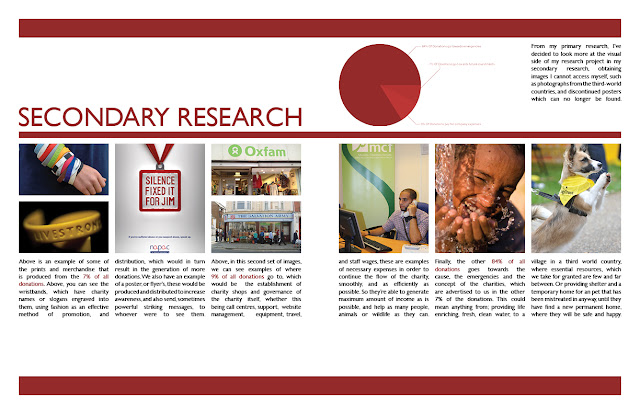
I then took to the internet and found images, which I couldn't find in my location, that represented the three sections of the pie chart, as you can see in my secondary research, below.
I then decided on my direction, where I was going to take my research.


Saturday, 17 November 2012

OUGD403: Studio Brief 3 - Message and Delivery (Post Crit)

Following the group crit, I've begun to make alterations to my mail shot, below is an extract from my post-crit analysis on my PPP Blog, which you can see here.
"Firstly, most importantly, is adjusting the variables to fit the brief, the sizing of the mail shots is wrong, it should be 220x110mm, mine is not. The original document in Illustrator is the correct size, however, due to the printer size adjustments and the crop marks being squeezed on the page, the mail shot as reduced by around 1-2cm, which I didn't notice. I'm pleased this was pointed out in the crit, otherwise I would have not met the criteria asked. Another error which was pointed out is the colour balance, in the illustrator file, I use two different shades of blue, and their half tones.  However, due to a printing error, again, some of the colours appear purple or grey, not looking like a half tone of one of the original blues, so, I must make this more clear in the improved mail shots. Another adjustment which needs to be made involves the sonar wheel, which can be found inside the leaflet, although I think this is a nice concept, It is hard to achieve, and it didn't work effectively. It was flimsy and it made some of the text hard to read, I also had difficultly obtaining appropriate split pins, so the ones I ended up with had a glittery texture, which do not fit the theme of the mail shot, so I'm going to remove it and only use the text under the sonar wheel.
Another dilema, I'm not longer able to access the digital print room, which means I'm limited to A3 paper only, so, I'm going to have to alter the fold of the page, so it fits on A3, rather than having a vertical crease, so it folds out horizontally which would exceed the page size, I'm going to have to have an horizontal crease, so the page folds vertically."
So, i've begun by sketching some new layouts for the altered design of my mail shot, in which I've accounted for limitation in size for the print.


I've decided that the bottom design would work better, as the top one looks rather basic, and it layed out in a rather odd manner.

The first alteration I've made is the composition of the mail shot, you can now see that it folds vertically now rather than horizontally, so this means it will fit on A3 to print. I've also decided to remove the sonar wheel, which spun on a flimsy split pin, as it distracted and confused whoever read it. It also added a bump in-between the two sheets of paper which were stuck together, so it felt bizarre to hold. It also tore in one of the mail shots. So, the text which was inside the wheel is now displayed in three columns on the bottom half of the page, for those who would like to read on.

I'm keeping the main heading a subheadings on  the inside of the mail shot, as from the crit we've established these worked rather well, so I'm going to use them within this design, and I've decided to place them on the top half of the mail shot.