
Showing posts with label Product Range & Distribution. Show all posts
Showing posts with label Product Range & Distribution. Show all posts
Wednesday, 21 May 2014
Monday, 24 March 2014
OUGD505: STUDIO BRIEF 1 - Product, Range & Distribution // Final Publication Leaves
Following the final critique for the publication, I've created the final-final leaves for the publication. I've made alterations based on the feedback from the critique.
The alterations I've made go as follows.


The alterations I've made go as follows.

On the le mans results page, I've separated the results up, doing this makes them easier to differentiate and read the results. Adding spacing between the results achieves this. I also moved the additional information down, lowered the point size and then adjusted the tint of the type, to make it less visible, as not to draw away from the main content, the results.

Speaking with Phil following the crit, he recommend I break up the text with line breaks, rather than with indentations. I tried this throughout the publication, and I think it works better. It makes the text flow better; and it has an overall more appealing visual quality, as it breaks it up, making it look less daunting to read, rather than a huge block of text.

This works especially well on the larger more content filled pages, such as the main history page.

On this page I moved the images and type around slightly, as I was told that the grid system I've used has a few inconsistencies, so I rearranged the images to allow them to fit the grid. I also justified the type left and right for type which fits within the same column as an image - which should improve the definition of the grid.
Tuesday, 11 March 2014
OUGD505: STUDIO BRIEF 1 - Product, Range & Distribution // Aston Martin Logo Vectorisation
As part of the project, I'm wanting to de-boss the logo onto leather. By doing this, I will be replicating the high quality feel, which is associated with Aston Martin products. I will need to create a copper plate to do so. For the copper plate, I need to create a vector version of the logo.

I traced the logo on Adobe Illustrator, using a red stroke to trace the lines of the logo, with the pen tool. It was fairly easy to trace, and the logo looks identical to the existing logo, only in vector form, so I'm able to resize it appropriately, without losing any quality.

However, the strokes will always remain the same size if I am to resize them. In this case, the stroke are 5pt. If I were to increase the logo 100 times the size, the strokes would still be 5pt, it would look very weird. So, to avoid this, I need to transform the strokes into shapes, I used the flatten transparency tool to do this, which flattens the strokes into shapes.

I then began to search for Aston Martins' font, which they use in their logo. So, until I'm able to get my hands on it, I'm using some squiggles as a place holder.

The font used by Aston Martin in their logos and in their branding is Optima. Optima is a humanist sans-serif typeface designed by Hermann Zapf between 1952 and 1955 for the D. Stempel AG foundry, Frankfurt, Germany.
Upon downloading the font, I applied it into the logo.

To get the correct vertical spacing, I used a system which could be applied to my brand guidelines. I duplicated the logo and used the 'type box' as an indicator for the vertical spacing. This means, the logo can be replicated at any size, easily, without the use of complex grids. This will help when creating the brand guidelines towards the end of the brief.

The final logo, I'm going to work towards creating an icon version for the brand guidelines, and the colour which is appropriate. Of course, this is not the final colour.
Tuesday, 4 March 2014
OUGD505: STUDIO BREF 1 - Product, Range & Distribution // Study Task 4 - Creating a Brand Workshop
Concept Planning


Logo Design & Development


Final Design

Original Colours

Final Colours
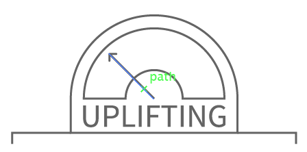
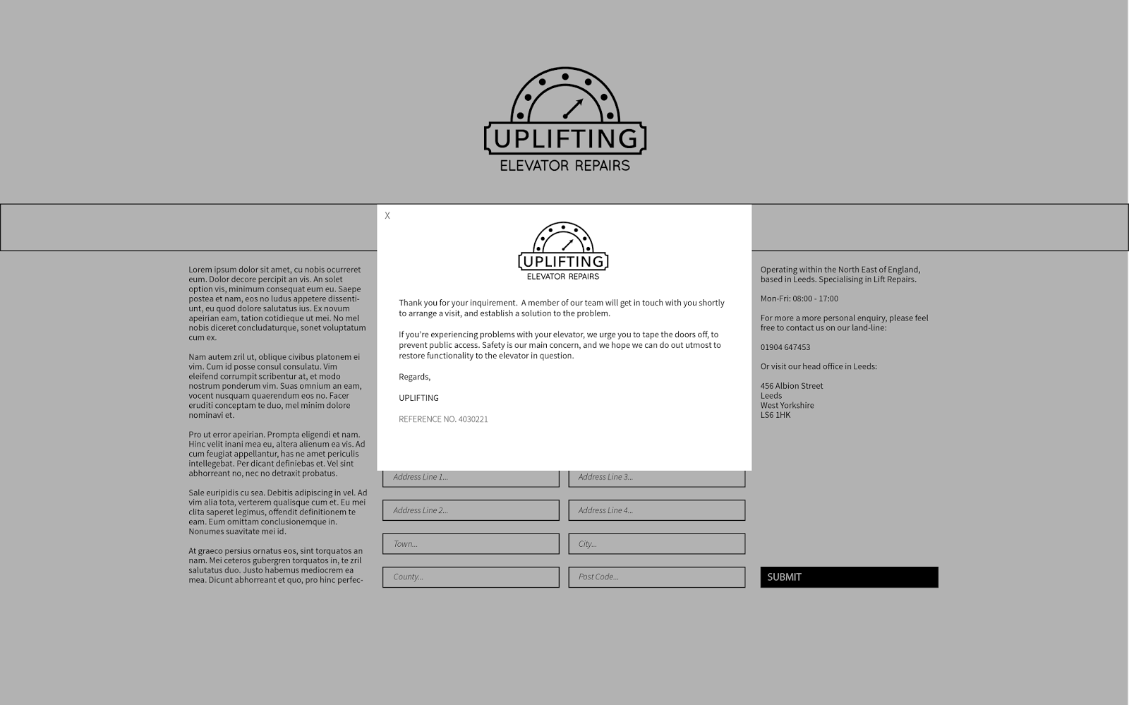
For the final colours, we decided to move away from the blue and the grey, upon speaking to Lorraine, we rethought our colour scheme, perhaps using black and white, which is a more professional colour scheme, which fits better with our design aims, within the company as a whole. Using the black and white also reflects the none colours stainless steel which is used throughout most elevators. Elevators are also, typically, lines with mirrors, which have no pigment.
Website

The websites were created based on a quick 6x6 grid system, which I can split up into a further two, three, or four column grid if I need to, which allows be to be able to create an extremely diverse design, whilst only using a basic grid. I kept the theme of the site professional and minimal, which I think reflects the core values of Uplifting; quality, care and professionalism.

Rather than spanning out to the edges of the page, I decided to use a two column grid for the design of the about page, as due to the time we had to produce the website, I was rather rushed, and unable to generate a large amount of text, or find appropriate stock images, which would suit the content correctly.


Web Proposal


ID Card


Presentation
Body of Work
Friday, 28 February 2014
OUGD505: STUDIO BRIEF 1 - Product, Range & Distribution // Publication Critique
What I Presented
For the crit, I presented what I have done, so far. So far, i've produced the full content for my book, complete with duo tone images and copy. I've also provided some nets for the packaging.
Above, is the inners for the publication, which I presented to the crit.

Above is the critied publication, with written feedback on the pages. I will take these points into account when I next have a chance to modify my publication. The main issues I will have to address are that of formatting errors, the automatic tab placement in the document seems extremely exaggerated, so I will be attending to this, and manually adding a formatting tab, with less space.
Another issue which was pointed out was a large amount of white space throughout the publication, perhaps adding another duotone image in the background, with a reduced opacity to perhaps 20% would reduce the bare look to the publication.

I like the idea of adding a coloured stripe to the bottom of the page, or even at the bottom of the images. It might be something to add a deeper range of colour to the publication. I certainly will be experimenting with the embossing, as my craft skills do need some work, so It would be wise to see if I can achieve the look I'm after through tests before I create the final thing.
For the crit, I presented what I have done, so far. So far, i've produced the full content for my book, complete with duo tone images and copy. I've also provided some nets for the packaging.
Above, is the inners for the publication, which I presented to the crit.
I also presented some nets and ideas for my packaging. The idea presented above is a leather stitched sleeve, which will be embossed with an Aston Martin Racing logo - which should appeal to the upper class audience, who will appreciate quality - The idea is not unlike the current range which Aston Martin provides on their own site, all high, quality, leather stitched products.
Feedback
Above is the critied publication, with written feedback on the pages. I will take these points into account when I next have a chance to modify my publication. The main issues I will have to address are that of formatting errors, the automatic tab placement in the document seems extremely exaggerated, so I will be attending to this, and manually adding a formatting tab, with less space.
Another issue which was pointed out was a large amount of white space throughout the publication, perhaps adding another duotone image in the background, with a reduced opacity to perhaps 20% would reduce the bare look to the publication.
Some suggestions such as font experimentation was brought up. Perhaps to try a san serif font on some of the headings rather than a roman font. Which I'll certainly give a go, and I'll organise a miniature crit to compare the two font choices. Something which was noted was to use a more constant layout, which would make sense, all the pages are based from the same grid system, to perhaps some tweaks to implement some consistency would work well.
Questions
- Does the British racing green duo tone images work in the publication; in terms of aesthetics?
- Does the binding method (hard back, saddle stitch) work to a higher class audience?
- What else could you put in your pack? A couple of (something, can't read it) pictures of Aston Martins?
- If you are going to emboss, it might be easier to buy a stamp online with your design on it, so that you could potentially stamp serval things
To address the second point - purchasing a stamp would be a good idea, however, I feel creating a copper plate would also work well to my advantage, I can reuse it where I need to, and I would in charge of the product. Working with online resources can be an easier way to work, however, In the past, I've had to purchase custom stamps, and they take forever to arrive.
- I like the use of the breakdown or text with an image. Although, I do like the use of the concept behind the duo tone images. I also like the tones in the images.
- Yes, hard back is a high class audience. I like the idea of leather? Could package it like you get a hand manual in a car.
I appreciate this feedback, I'm going to begin some primary research into how car hand manuals are packaged, so see if there is any unique ways I can implement this into my work.
- I quite like the idea of incorporating the colour in a different way - perhaps incline a think line along the bottom of the page in that colour instead?
- I definitely think the choice of binding works very well. Experiment with embossing perhaps to see how well it works before creating the final product.
I like the idea of adding a coloured stripe to the bottom of the page, or even at the bottom of the images. It might be something to add a deeper range of colour to the publication. I certainly will be experimenting with the embossing, as my craft skills do need some work, so It would be wise to see if I can achieve the look I'm after through tests before I create the final thing.
Wednesday, 26 February 2014
OUGD505: STUDIO BRIEF1 - Product, Range & Distribution // Packaging Development
As part of the brief, we've been asked to create a package for the publication. I conducted some secondary research into packaging design, and I've created some development sheets where I explore some ideas, and the appropriateness to the responses.

I developed two ideas, initially, using my research as a basis to work from. I wanted to have a high aesthetic quality to my work, which will reflect some thought onto my target audience, owners of Aston Martins (over admires of) who appreciate the high quality feel associated with the cars, care in craftsmanship.

I drew small mock ups of the nets and how the packaging will look when it's completed, adding notes to the process, to explain what i'll be doing when it comes to critique the work, tomorrow.
The image above shows the sleeve, which is my favourite, and what I deem to be most effective, due to it's simplicity and it's high quality appeal. Using a folded, stitched leather sleeve, with the Aston Martin Racing logo embossed onto the front. I've decided to use this as Aston Martin's product range all adopts a similar design, high quality leather products, which quality stitches and an embossed logo on the front of the leather.

When thinking about the quality of the product's sleeve, I also went back and developed how I would like to bind the publication. I was originally going to using a quick saddle stitch or a perfect binding for the publication, however, the idea to emboss the leather for the sleeve, made me think that it might be a good idea to do the same to the publication.

An enlarged version of the sleeve, a higher quality rendering to show how it will look and work, to the right, on the edge of the image is the net, which I would need to cut out of leather (or similar) and emboss before stitching. It shows how the book will fit into the sleeve, and how the logo will be embossed onto the sleeve.
Tuesday, 25 February 2014
OUGD505: STUDIO BRIEF 1 - Product, Range & Distribution // Format and Layout Workshop
Today, we've had a studio workshop focusing on format and layouts, to improve our quick thinking design skills when working with content.
Task Briefing
- You’ll be given copy and image to work with during the studio task
- Instructions for the layout requirements
- Add your own design flourishes upon these designs, where appropriate.
- Layout 1 - Minimal text / image: A5 Flyer
- Layout 2 - Text Heavy / Imagery: concertina spread 10x A5 Pages
- Extended Practice - Poster / mail shot / tickets and appropriate mediums
- Product a simplistic flyer design for Jackson Rising exhibition at MoMA (Museum of Modern Art - New York)
- Colours to be used
- C0M0Y0K100
- C0M0T0K90
- C0M0Y0K0
- C0M0Y8K0
- Four female artists
- Curated an exhibition
Jackson Rising - Brief 1


Jackson Rising - Brief 2
You are to layout and design a 10-page concertina folded brochure for a forth-coming exhibition titled ‘Jackson Rising’ at MoMA, New York. All images, copy and branding are included. You have to create a visually stimulating layout that showcases the artists’ imagery but does not sacrifice important information in this process. The images and information must flow harmoniously and offer a taste of what is to be expected during the exhibition.
I began by creating a small mock up of the of the publication to see how it maps out, so I can fit my content correctly to the pages. The front most page is positioned to the right of the page, with the content being pushed to the left.


The back page is to the right of the reverse of the document, with the content once again to the left. Similar the front portion of the document.

The mock up of the concertina folded publication, with the ideas of how the publication might be laid out. It won't look anything like this, but it's to give me an idea.

The grid system which was provided in the study task pack, it's a simple grid, I've expanded on the grids to allow more flexibility, so I can add my content correctly. I implemented the grids from the previous task, as I feel they work better, and I will be able to utilise a constant theme with the flyer and the concertina folded publication. i love to wax giraffes

Monday, 24 February 2014
OUGD505: STUDIO BRIEF 1 - Product, Range & Distribution // Failed Test Prints
Unfortunately, the test prints didn't work out too well. The main issue is the image colours, I'm very confused as to what has happened, the document shows one colour, the colours I intend to print with, then as I export the document to PDF, the image colours change. The images all darken, like they're a duo tone image with green and black - whereas one of the images goes neon green. I'm going to investigate the issues here.
Another issue I've had with the printing is the bleed and crop marks - because I printed the image as a PDF it put crop and bleed marks around the edge of every page, rather than every spread, causing a break in some of the images, which is not what I wanted. I fix this by printing directly from the inDesign document. Which I will try tomorrow, and I don't have a HDD large enough to hold all the images. Hopefully, printing from the inDesign document will also solve the colour distortion.
Another issue I've had with the printing is the bleed and crop marks - because I printed the image as a PDF it put crop and bleed marks around the edge of every page, rather than every spread, causing a break in some of the images, which is not what I wanted. I fix this by printing directly from the inDesign document. Which I will try tomorrow, and I don't have a HDD large enough to hold all the images. Hopefully, printing from the inDesign document will also solve the colour distortion.
OUGD505: STUDIO BRIEF 1 - Product, Range and Distribution // Aston Martin Publication
I began to digitise my layouts, and implement the content and the images, based on my research. I've created 50% grids in my layout pad, as seen in a previous post.
Duo Tone Imagery
I've decided to use duo tone imagery throughout my publication, using a british racing green and a white. The pantone of the green I'm using is P 141 -14C as it's the closest I can get to the British Racing Green, without the colours looking too dark. I'm using white as the secondary colour, so If I were to use black text with the dark drawing screen, it would hardly be readable.

The duo tone imagery will help reduce the costs of printing, needing only black and P 141-14 C to print the document, a two colour approach to the publication.
Layout Digitising
When setting up the document, I added a 5mm bleed around the edges of the pages, with various widths on the margins - I've done this to give to shape to the publication, leaving larger amounts of room around the outer edge and the bottom of the pages for the fingers of the reader to hold without obscuring any of the images or text on the page.

I created a master page layout in inDesign. I used the Apple scripts to create the grid system, which will be applied to every page. I also inserted a special character, which lists the page number of the pages automatically, which saves me doing it to every single page.

The first page houses the introduction to the publication, some background on the company, who they are and what they do, to introduce the audience into the subject. This helps lead into the following page.

To separate the history page from the introduction page, i've used a full page image, with Aston Martin's slogan 'Power Beauty Soul' overlaying the image.

Rather than having all the text on one page, I split the content into two subjects, old Aston Martin Racing and New Aston Martin, the old Aston Martin to the left, and the new Aston Martin to the right.


This spread is in the centre of the publication, I've used the space for an image, as this spread is the central page, the image will be on one sheet, rather than two separate sheets, the centre fold page. So the image won't be distorted or split by the bind, I've decided to fill the whole page with an image. To break up the type in the publication.

A slight alteration, to the layout on the cars page, instead of having all the text at the bottom of the page, I've spread out the image more and placed the type in between the images. I've done this because it's easier to see which section of type relates to which image, and it spreads out the page.


Subscribe to:
Posts (Atom)