Concept Planning
Logo Design & Development
Final Design
Original Colours
Final Colours
For the final colours, we decided to move away from the blue and the grey, upon speaking to Lorraine, we rethought our colour scheme, perhaps using black and white, which is a more professional colour scheme, which fits better with our design aims, within the company as a whole. Using the black and white also reflects the none colours stainless steel which is used throughout most elevators. Elevators are also, typically, lines with mirrors, which have no pigment.
Website
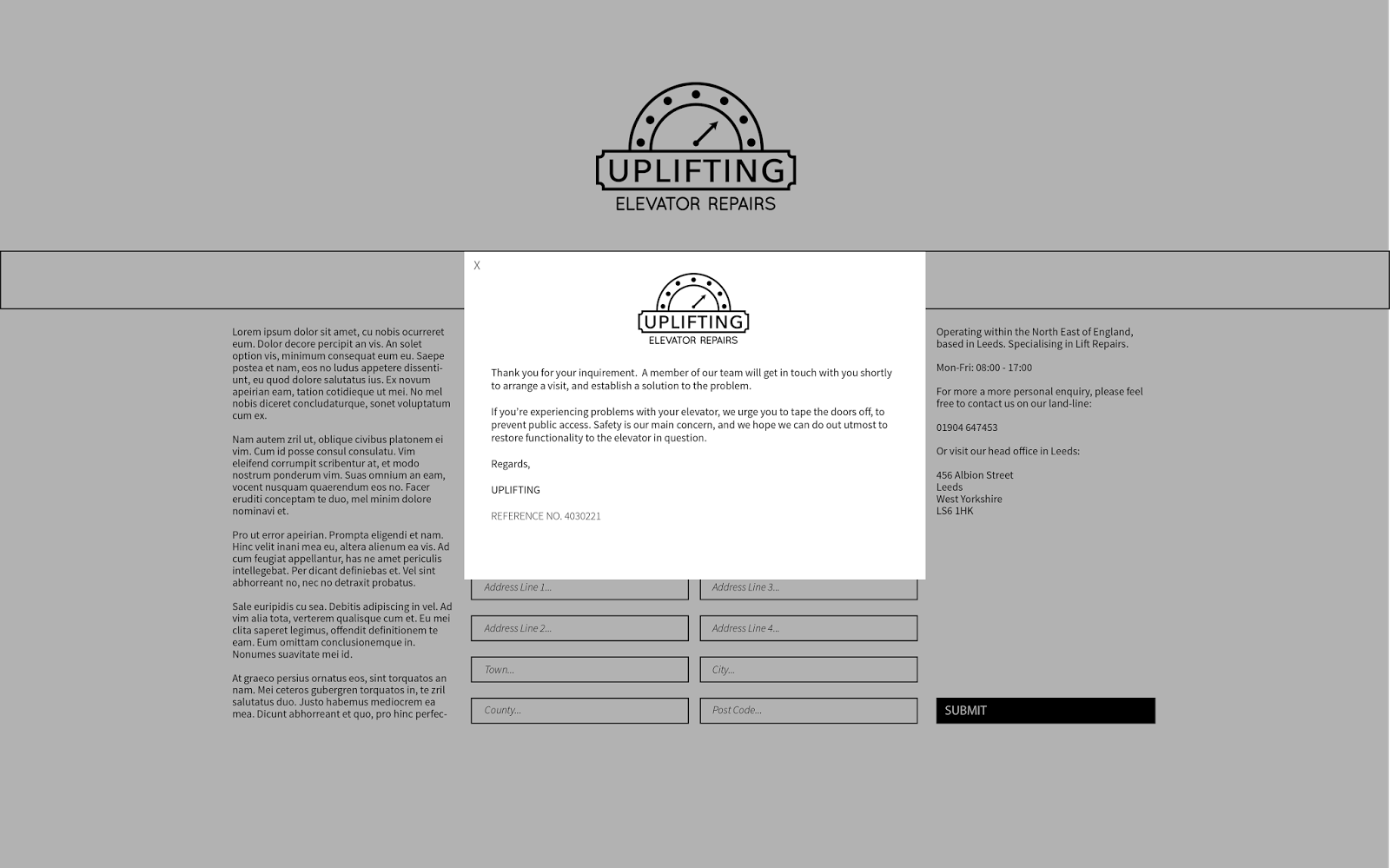
The websites were created based on a quick 6x6 grid system, which I can split up into a further two, three, or four column grid if I need to, which allows be to be able to create an extremely diverse design, whilst only using a basic grid. I kept the theme of the site professional and minimal, which I think reflects the core values of Uplifting; quality, care and professionalism.
Rather than spanning out to the edges of the page, I decided to use a two column grid for the design of the about page, as due to the time we had to produce the website, I was rather rushed, and unable to generate a large amount of text, or find appropriate stock images, which would suit the content correctly.
Web Proposal
ID Card
Presentation
Body of Work


No comments:
Post a Comment