
Showing posts with label Design For Web. Show all posts
Showing posts with label Design For Web. Show all posts
Wednesday, 15 January 2014
Tuesday, 14 January 2014
OUGD504: STUDIO BRIEF 2 - Design for Web // Final Website Screenshots
As the website is now completed, I thought I should upload screenshots of how the site now looks. I'm extremely pleased with how it's turned out, and it's overall aesthetic. It seems to look very similar to how I planned it.

The homepage, with the site description, and a scrolling banner.

007 Origins, a description of how Bond became.

The Timeline, the actors and the films in order.

Statistics and Trivia, the cars of bond.

Production History, fairly self explanatory, with an embedded video.
Monday, 13 January 2014
OUGD504: STUDIO BRIEF 2 - Design for Web // Mobile Device Proposal
I'd like my website to be usable on multiple platforms, as it is 2014, mobile compatibility is almost expected. Websites work dynamically to change their appearance and format depending on the device. However, due to my developing skill set's low ability, at this stage, I'm unable to create a mobile dynamic website. So i'm proposing them.


Currently, my website looks like this, on most monitors. Depending on the resolution of the monitor, the page may be smaller or larger. However, it will always be central.
Here is my proposal for the vertical iPad format. The models displayed are the iPad Air and the iPad Mini. The site hugs the sides of the screen, taking advantage of the displays size, to increase usability.
When flipped horizontal, the iPad doesn't distort the images and the page size, it simply centres and adds a white background. To assure the images and the text are still clean.
As the iPhone has a much smaller screen, I've decided to shrink the navigation bar down, allowing for two rows. The images and the text also hug the sides of the page. Taking advantage of all the space available.
Thursday, 12 December 2013
OUGD504: STUDIO BRIEF 2 - Design for Web // Coding The Slider
In my website, I wanted to have a sliding banner. I didn't quite expect this to be as difficult as I thought it turned out to be. However, I managed. I had to find some recourses online to make it work.

I managed to find a jquery.js online, which most developers use to code with. The jquery is incredibly complex, something which I could never every be able to code on my own. As you can see above, it's about 20 full screens worth of java script.

I then looked at some web tutorials and coded the slider.js Adjusting the number in red, controls the time per slide.

The styles.css sheet is being used across all my pages, to avoid this, I created an addition .css to link only with my index.html I created the properties for the slider in this .css

I linked it to the page, using the same method as I would with any other css.js page, I also linked the jquery.js and slider.js pages to the index page. So they would all work together.

I created a list item, which would contain the images I would place in my slider. I experimented by using an overlay, which had an image title and some descriptive text, however, I didn't think this was necessary, so I turned the opacity to 0% in the slider.css
Tuesday, 10 December 2013
OUGD504: STUDIO BRIEF 2 - Design for Web // Final Crit Feedback
The final crit is an opportunity to show the work we've done at this point in time. I presented the current state of my website, my coding and my design boards. It was done in a similar format to the previous crit, divided into two groups, one group lays out their work and leaves the room, whilst the other group anonymously crits the work - which allows for more honest feedback. Following which, the original group returns to receive their feedback. Then the second group lays out their work, and so on.
Before I left the room, I left some questions, questions which I would've liked to be answered, which will help me progress in the right direction.
- Do you want to stay on the website when you use it?
- Is the minimalist theme appropriate?
- Does the timeline communicate the order of bond actors correctly?
The first sheet of feedback I received said the following;
- Considering the visuals of James Bond films the site is a little tame by comparison - homepage visuals are effective but need to command more of the page.
- Can keep minimalist to stay with classy theme but need to bulk it up a bit.
- Timeline is effectively communicative - may require more info (could roll over to present info box)
I felt these comments were fair, although I feel the homepage is fair adequate, I could always try to increase the resolution. Although the current resolution has been informed by my research, and fits a more minimalist style - it's definitely something to consider, though. It might be too late in the game to change this, so I could propose it. I could also add some more content to the homepage, although I don't really want to overwhelm it, I feel the essentials is all it needs. I thought about doing something similar to the timeline page, but I couldn't quite figure it out, I'm definitely going to try and code it over Christmas, but if i can't I'll propose it.
Second Sheet of feedback:
- Logo at the top - though it was 510 Bond, at first
- Any more content?
- Refreshing central content could link to (or be more relevant to) other pages
These comments were rather short, vague but I got the idea. I'm going to edit the logo, as a number of sheets said the same thing, it's a quick job, so it's no problem doing it. Any more content? This website is work in progress, so yes, there will be. This comment was rather vague. And the central content does link to the other pages.
The third sheet
- Good that it's responsive - looks more professional
- Could be a little more eye-catching (first page)
- Maybe colour accent taken from the images
- Rollovers may need to be slightly more obvious that they are actually buttons
- Timeline is great - like the use of something different - circles/zig-zags. This is more eye-catching than the first page. Could be used to make people stay on the website
- I would work on the timeline layout (as in use it as a running theme throughout)
I agree the first page could be a-little more eye-catching, this seems to be an reoccurring theme across the feedback sheets, so I'm tempted to add more appealing content. The colour accent is a good idea, although taking colours from all the images would take aways from the minimalist style. I could try making a static image and taking a colour accent from that, a static image which would appear on all of the pages, perhaps. I disagree with the rollovers needing to be more obvious, firstly because they're not made from images, they're made from 'a href' texts, in using classes from the different states, so they're not actually buttons, they're text links, also, I think having more vibrant and obvious links take alway from the subtle minimalist theme with the website, although I could adjust the colours slightly to make it marginally more obvious. I'm wanting to use the timeline circle/zig-zag style across more pages, as it seems to have gone down well.
The fourth sheet of feedback
- The website is nicely designed. It uses a very clear and structured layout which makes it very easy to use
- The minimalist approach looks sophisticated but could be modified to resemble the action packed themes of the Bond films? Possibly more colour?
- The scrolling images work well, although they could be slightly more relevant to the content/pages used on your website - this would give users a better understanding of what your website intends to explain to the users.
- The timeline looks great - it is a creative and clear way of showing each Bond actor - it might be useful to include a brief intro something on the page, to summarise what you're showing.
- On the homepage, maybe place the '51' closer together so it is more readable - at first it looks more like 5 and 1 are separate.
The slider images actually link to pages in the website, although at this point they are redundant, they will be used soon, once I have more content on the pages. As I have said I am planning to sort the 51 out on the logo, it is too far apart, this feedback sheet isn't the first to tell me this. I don't think I need to make the website more action packed, when you're thinking of Bond, half of the character is the action packed spy, but the other half is the sophisticated 'gentlemen', which is what i wish to capture in the website.
Saturday, 7 December 2013
OUGD504: STUDIO BRIEF 2 - Design for Web // Final Website Layouts
Following making my scamps. I finalised the designs for my website's pages. It's based on the rule of thirds, when split down into 'the rule of ninths'. So the design is more aesthetically pleasing.

Above is the layout of the Timeline page. It will feature images of all the bond actors.


Sunday, 17 November 2013
OUGD504: STUDIO BRIEF 2 - Design for Web // Web Design Layouts
I created some layouts for my website. I need to know what goes on which page, how I want it to look initially. Of course, these will be refined to the final layout before I digitise them.

The homepage will have a side-scrolling banner, and some welcome text.

You can see above and below, several variations of the home page design.


I looked at multiple ways of arranging the type on the page. Using a fairly complex grid system. Sort of the rule of thirds, taken to the extreme.

I also mocked up a website map. To show how the website would navigate.

I thought about adding a footer to the website, I need to consider what is relevant. As there's no point adding social media links if it doesn't fit the audience.

I thought how the footer would fit into the design, and how the navigation bar might look.

I also mocked up how some other pages would look. Above and below are the timeline pages, the production history page, the origins page and the trivia page.

Tuesday, 5 November 2013


OUGD504: Studio Brief 1 & 2 - Design for Print & Design for Web // Peer Review session
Adam - Design for Print and Web
- Put It In Print
- Info pack / publication - mind map inside
- Screen printed - effort?
- Aimed at anyone in college who would need advice on printing
- Card game themed website
- Perhaps a conflicting idea with the audience - adding drinking games with traditional family card games could cause problems
- Create a page spread and focus on content specifics?
- Minimal aesthetic would definitely work well
- Maybe think about dividing categories and sub categories to eliminate cofusion of navigating
- Scrolling family tree is interesting
- Content: Origins, timeline, actors - cars?
- Get your websites drawn out so you can get good
- Website audience? Who and why would someone use your website?
- An info graphic would work well for the family tree thing, would make it easier to view a lot of information.
- Having one large page for all of the actors could make navigation difficult - lots of information to put in one place - might be hard for the user to find a particular actor.
- T-shirt packaging, screen printed t-shirt, information printed onto the box. Visually interesting.
- Fairly complex, might you be doing too much?
- Interesting way to communicate your information
- Try taking a step back, what do you want to communicate, and create a solid concept
- Print Info pack
- Lots of books, bound by two pieces of wood a laggy-band. Too much work?
- You want to do a lot of stuff, I feel like it might be overwhelming in the month we have to create it.
- I feel, after looking at your design context blog, that you could really benefit from some more idea development. Your concept seems to have come from someone else's idea - almost identically.
- Good primary research, now apply it!
- Concept: Processes booklet // Survival Guide for Printing. Examples of different processes, different stock considerations, the whole shabang. Stick it all in a fancy box - like a survival guide.
- Sounds like a lot of stuff, perhaps a more simple approach could be effective.
- Talking about approachable printers is a grand idea for new students! Very helpful!
- Concept: Infopack - what you need to know, to get started in print. Aimed at students.
- To be bound using a paper fastener - interesting concept! Useful, flexibility and diversity being able to cater to different needs.
- Print is Dead // Print is Alive - ace! I love the over printing idea, really interesting!
- Simple. Effective. Grand.
- The texture touch 'n feel idea is a great way to engage the audience, something different new and interesting.
Tuesday, 29 October 2013
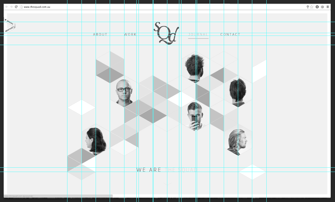
OUGD504: STUDIO BRIEF 2 - Design for Web // Grids Workshop
As part of this session, we were asked to select 5 web sites, which you can see here in my design context post. We then found the existing guides from the websites. This task really helped my develop my designs, previously, in my initial home page design, which I created in a session. I now have a much more advanced idea of what to create in terms of grids when designing. Which, you will see in my future designs. Below are the grids marked out ontop of the websites.


OUGD504: Studio Brief 2 - Design for Web // Workshop 01
Web standards and limitations
Layout
Setup
Basic coding
Web Standards (Acronyms, Abbreviations & Stuff)
HTML - Hyper Text markup language
XHTML - Extended Hyper Text Markup Language
CSS - Cascading style sheets
WYSIWYG - What you see is what you get
SEO - Search Engine Optimisation
FTP - File Transfer Protocol
URL - Uniform resource locator
XML/PPP
UI - User Interface
UX - User Experience
WWW - World Wide Web
Limitations (or, Designing for the lowest common denominator)
Web safe colours - 216 colours
When colour first arrived on the web computers could only support a maximum of 256 colours on their 8-bit monitors. A list of 216 “Web Safe Colours” were identified.
These colours were/are reproduced consistently across the web using HTML, specifically a six or where possible a three digit hexadecimal code.
Red
#FF0000
#FF0
White
#FFFFFFF
#FFF
Black
#0000000
#000
The RGB colour mode is capable of reproducing 16 million different colours, significantly more than HEX 216 colours.
The combination of Red, Green and Blue values from
0 to 255 (256 unique shades for each value)
Red 256 x Green 256 x Blue 256 = 16,777,216
This wider range of colours can now be reproduced using CSS rather than HTML. These colours are identified using the same principles and Photoshop and Illustrator, by specifying the percentage of 255 per RGB.
For example 100% Red would be: RGB(255, 0, 0)
Web Safe Fonts - For a chosen font to display consistently across different computers a standard font must be used.
Further to this a font-family is chosen giving several “fallback” options to ensure maximum compatibility between browsers and systems. For example is the browser/system does not support the first font it tries the next one listed.
Some common font families:
Serif Fonts
Georgia, serif
“Palatino Linotype”, “Book Antiqua”, Palatino, serif
“Times New Roman”, Times, Serif
Sans-Serif Fonts
Arial, Helvetica, sans-serif
Tahoma, Geneva, sans-serif
“Trebuchet MS”, Helvetica, sans-serif
Verdana, Geneva, sans-serif
CSS font-face - The CSS compatible @font-face allows you to install fonts to a website, meaning the font choice remains consistent regardless of the browser or system.
However using font-face breaches licensing and copyright laws related to specific font foundries.
There are many free font websites which include free licenses' usage for @font-face kits including Font Squirrel.
Size, dimension, pixel resolution (not to be confused with DPI or PPI)
640 x 480
800 x 600
1024 x 768
1920 x 1080
2880 x 1800 (220ppi)
File Formats
PNG
GIF
PDF
JPEG
~
72ppi? (SInce 1995 they've been 96ppi and now, with retina display, displays are 220)
RGB
~
Lossy
Compressed

For next week, create 3 separate designs, which you would like your wbesite to look like. With fonts, etc.
Layout
Setup
Basic coding
Web Standards (Acronyms, Abbreviations & Stuff)
HTML - Hyper Text markup language
XHTML - Extended Hyper Text Markup Language
CSS - Cascading style sheets
WYSIWYG - What you see is what you get
SEO - Search Engine Optimisation
FTP - File Transfer Protocol
URL - Uniform resource locator
XML/PPP
UI - User Interface
UX - User Experience
WWW - World Wide Web
Limitations (or, Designing for the lowest common denominator)
Web safe colours - 216 colours
When colour first arrived on the web computers could only support a maximum of 256 colours on their 8-bit monitors. A list of 216 “Web Safe Colours” were identified.
These colours were/are reproduced consistently across the web using HTML, specifically a six or where possible a three digit hexadecimal code.
Red
#FF0000
#FF0
White
#FFFFFFF
#FFF
Black
#0000000
#000
The RGB colour mode is capable of reproducing 16 million different colours, significantly more than HEX 216 colours.
The combination of Red, Green and Blue values from
0 to 255 (256 unique shades for each value)
Red 256 x Green 256 x Blue 256 = 16,777,216
This wider range of colours can now be reproduced using CSS rather than HTML. These colours are identified using the same principles and Photoshop and Illustrator, by specifying the percentage of 255 per RGB.
For example 100% Red would be: RGB(255, 0, 0)
Web Safe Fonts - For a chosen font to display consistently across different computers a standard font must be used.
Further to this a font-family is chosen giving several “fallback” options to ensure maximum compatibility between browsers and systems. For example is the browser/system does not support the first font it tries the next one listed.
Some common font families:
Serif Fonts
Georgia, serif
“Palatino Linotype”, “Book Antiqua”, Palatino, serif
“Times New Roman”, Times, Serif
Sans-Serif Fonts
Arial, Helvetica, sans-serif
Tahoma, Geneva, sans-serif
“Trebuchet MS”, Helvetica, sans-serif
Verdana, Geneva, sans-serif
CSS font-face - The CSS compatible @font-face allows you to install fonts to a website, meaning the font choice remains consistent regardless of the browser or system.
However using font-face breaches licensing and copyright laws related to specific font foundries.
There are many free font websites which include free licenses' usage for @font-face kits including Font Squirrel.
Size, dimension, pixel resolution (not to be confused with DPI or PPI)
640 x 480
800 x 600
1024 x 768
1920 x 1080
2880 x 1800 (220ppi)
File Formats
PNG
GIF
JPEG
~
72ppi? (SInce 1995 they've been 96ppi and now, with retina display, displays are 220)
RGB
~
Lossy
Compressed

For next week, create 3 separate designs, which you would like your wbesite to look like. With fonts, etc.
Wednesday, 23 October 2013
OUGD504: Design Production - Design for Web // Website Development Workshop
As part of this session, we were asked to think about 5 pages which our website would contain. The point of this task was to give us some idea of what we would want in our website, the amount of pages and content will always have a huge impact on the site. You can see below, in the image, the pages I have chosen to create. You can click to zoom in, of course.


Following the development on the content of the website, we were then asked to quickly sketch up a rough design for the website’s home/index page. (This is in no way the final design.)

You can also see the feedback I received in post-it notes around the design. The general feel from the feedback was that I had to reduce the amount of content which I suggested with the design. As they all mentioned a Bond themed website should really have a minimalistic, sophisticated look to it - to which I agree. So, as part of my design development, which will definitely be informed from this, I will try for a very clean design style.
Subscribe to:
Posts (Atom)