Showing posts with label Design Practice 2. Show all posts

Wednesday, 19 February 2014

OUGD505: STUDIO BRIEF 1 - Product, Range & Distribution // Final Layout Designs

I've spend the majority of today working on the final layouts for my publication. I developed a grid system, experimenting with different variations of columns and grids. To find the optimal grid for the layout of my content. I developed how my content would be laid out across the allocated 16 pages. Designating a certain number of pages for each subject I'm including within my publication. 


The first page of the publication will feature the Aston Martin racing logo, and a short piece of introductory text, explaining the publication and it's purpose. 


The second page will feature a large powerful image, with the Aston Martin tagline 'power beauty soul', overlaying the image. Doing this will really start the publication off, the using the image to convey the emotions which are associated with Aston martin. To the right will begin the history portion of the publication. 


Continuing the history section of the publication, using some images, to illustrate the moments in history, making it sound more interesting, more exciting, using the images and type to form an accurate mental image of how Aston Martin Racing came about. 


More history, which will take up the majority of the publication, using another image to illustrate the history, to work with the type. 


The following page is a image, it will be the centre fold of the publication, so I can utilise this space for a large image. It also works to break up the publication, to show that we're leaving history, and moving onto the next topic. 


I've dedicate a spread to the cars which are used in AMR today. Four images, displayed horizontally, to complement the shape and form of the car, underneath in the columns are four columns, one for each image. 


I then allocated a page to the teams, as there as so many teams, it would take a whole publication in itself to speak about them all, so I think it would be best to categorise the teams, as I have done in my development, and keeping the team information brief. The adjacent page will contain a large image, to break up the content. 


The final spread of the publication displays the feats of Aston Martin racing. I've used the central row to display and image, spanning across the two pages, an almost cinemascope image, which compliments the speeds of AMR, by using the horizontal, streamline space. 


The final page of the publication is for the closing thoughts, the conclusion, and the closing statements to the publication, I don't want to overload my content on this page, as I want the publication to have a light ending. My research and early scamps depict this layout for the lighter-content pages, and I think applying it on this page would be more suitable. 

Thursday, 13 February 2014

OUGD505: STUDIO BRIEF 1 - Product, Range & Distribution // Layout Development

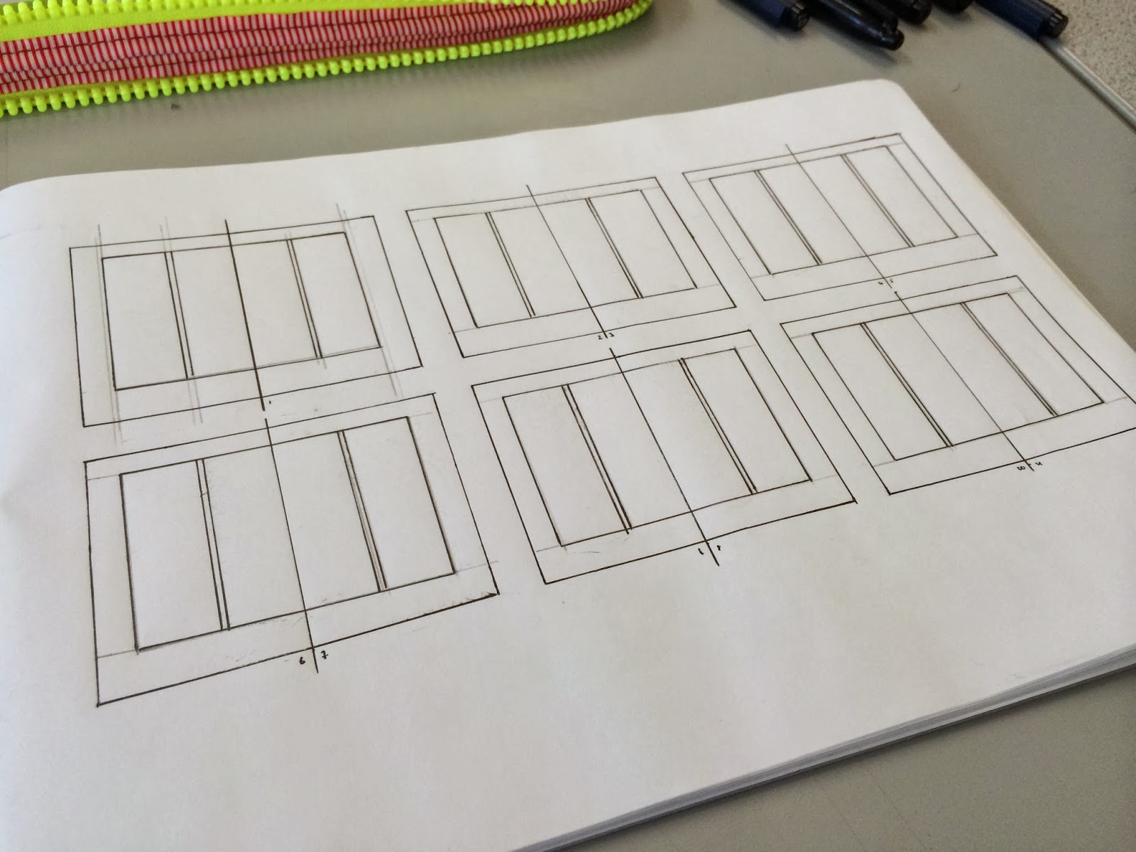
I created some initial layouts a few days ago, based on layout research, since then, I've conducted further layout research, so I can develop my layouts, into a better resolution than before. I designed the layouts on a larger scale than before, so I can include gutters and margins, more easily. Adding margins and gutters will help me plan how I will fit my content onto the page. 


I drew out onto some spreads the margin area around the edges of the pages. I allowed the margin to be greater around the outside and bottom edges of the page, as this gives the reader room to hold the publication without obscuring and covering the text. Part of my further research posts, I discovered that a vast majority of the layouts designers used have a larger area around the content boxes, to assure easy readability. 


I then added in the columns. I wanted to test a two column layout, to see how the content would balance out. The two columns can be divided down into a further four columns if needed, to help fit the content correctly. The two column layout is good for smaller publications, such as A5, as it allows you to fit 7-8 words per line, which is what I'm wanting to use for the best readability. 


I added three rows, which can be subdivided down into a further six rows, to help align the images and type. The rows will be used throughout, to assure a consistent grid system, for a more visually appealing publication. It allows me to fit my content, with equal spacing, and perfect alignment, whilst also breaking up the page, where necessary. 


I create six layout variants using this system. Creating six layouts allow me to see the effectiveness of the grid system, to see how the type and images work together. I can use this to compare with other grid systems I may experiment with. 


I also experimented using an equal width margin around the area of the content box. I did this to have a comparison with the larger variant widths content box. By doing so, I can see the effectiveness of he two sizes, and see which also looks better. Personally, I feel more inclined to use the variant widths margins, as I think the look better, more professional, almost like there has been thought behind the design, rather than a standard, equal sized margin. 


I tried a three column layout, to compare with the two column layout. The thinner columns offer a more compact look, if the publication is very type dense a three column layout may work to my advantage. It also allows for a more sophisticated complex grid system, as the columns can be split down into a further six or nine column grid. I've done this, because if I choose to implement the grid, it could become very complex, and interesting. 


I used three horizontal rows to separate the columns, and create the grid system. I then applied some content to the layouts to see how they would look, based off my research. This allows me to see how the final resolution might look. In comparison to the two column grid system, I'm not such which I prefer, so what I might do is create six column grid system, where I can alternate between the two.

I quickly mocked up a six column grid, and applied the the copy to it, using a two and three column layout. 


The six column layout is the right direction I need to head in. It allows me to alternate between two and three column widths, and allows me to use six columns if needed, for a greater, more complex grid system, which if executed effectively, will allow me to produce a well designed, aesthetically pleasing publication. 


Wednesday, 12 February 2014

OUGD505: STUDIO BRIEF 1 - Product, Range & Distribution // Publication Scamps

Following my research post which looked at layout, I've begun to apply the layouts I sampled within my own layouts. Doing this, using the work of other designers, teamed with my own ideas, should help improve the overall quality within the publication. These are just thumbnails overall, which I will develop using further layout research, when I increase the size, creating the final design. 


I mocked up a few thumbnail layouts, based on my research. I've created them in a way to see how they would fit the content. The subject is all about 'Power, Beauty, Soul', which is Aston's tag line. So to express this through my layouts, imagery will be extremely important. I've tried to create the scamps with images in mind, devoting a larger amount of space to the images, and allowing the type to fit around it.


I've tired to add variation in the layouts, some of the images will need more copy with them, some explanation and some context. Therefore I've altered the layout to accommodate for the copy, allowing more or less space. On some of the scamps I've explored the idea of having a larger amount of white space around the type and copy, the bottom right scamp for example. 

Wednesday, 5 February 2014

OUGD505: STUDIO BRIEF 1 - Product, Range & Distribution // Studio Workshop - Time Management

A small workshop, where we were asked to create a time management schedule, a guide to follow throughout studio brief 1, as it was evident in the last module that time management was an issue amongst a few of us. 


I labeled the dates along the right hand side, to indicate the time scale. I have between now and the 18th of March to complete the first studio brief for this module. 


A shot of my week planner in full, I hope to stick to it for this studio brief, and see how my time management improves throughout. 

Tuesday, 4 February 2014

OUGD505: STUDIO BREIF 1 - Product, Range & Distribution // Research Boards Feedback

Following the research boards, I presented them and spoke about Aston Martin, speaking about the range of research I'd done, extending what was on the research boards, with knowledge I've gained, as you'll see on my Design Context blog. I spoke to a small group of 7, running through my research process, from the cars, the history, the centenary, the concepts and the artwork - a flow of work, explaining how I got from one to the other. I received the following feedback:

Pros

  • Good range of images and text, balanced ratio, the text isn't overwhelming, and there aren't too many images, they all serve a purpose, in delivering information.
  • The research board's order reflects the direction I headed in, you can clearly see how I transitioned from one topic to the other.
  • Interest is certainly showed, it comes across in the attention to detail and reflection in the presentation.
  • Consistent grid structure throughout, clear that design awareness is evident in the boards.
Cons
  • Consider different fonts for my copy and headings, using different weights to establish order in the boards
  • Don't speak in first person! Clients won't care, stop doing it!
Overall, I can't really complain about how they turned out, usually, I try to use different weights on my fonts, however on this I didn't, I'll try and use them next time. I will an extra effort not to speak in first person, in future.

Boards Workshop

We then crit the research boards, passed them around and labeled what was bad, and what was good. What could be fixed, we ended up being extremely petty, but the best things are perfect, so we need to be petty to get the best result.


"Your name is missing on the boards, I think your boards would benefit from having the title on each board stand cut a bit more as I was searching for it. Good images and a clear system".  It's fair feedback, I do need to include my name on my board, although I wasn't aware it was mandatory. Including a larger title might also work too, however, by increasing the weight of other fonts, I can establish order. 


"Minuscule spacing" I don't understand this comment, the type and images fit in the gird, it's the same throughout, I suppose due to the white space, it's probably subjective. "I would write it is, more professional and as Aston martin very high end, I think language should reflect" Another fair comment, I'll attempt to adapt my writing style and my vocabulary to suit the audience. 


Grammar errors, fairly standard, I'll be sure to get someone else to proof read my work in future. 


I measured out these two gutters from the closest points, they both measure to 5mm. They're all created using the same grid system. It must once again be subjective. 


I spoke in first person a lot throughout the boards, it's something I must rectify. Speaking in a different person, such as third person, would be more affective, as the client doesn't care. 


A black line down the side of some of my images, it's petty, but it doesn't look good. By cropping the images, I can get rid of this, it's an easy fix. 

Monday, 3 February 2014

OUGD505: STUDIO BRIEF 1 - Product, Range & Distribution - // An Exhibition of Aston Martin - Research Boards

Following my research, I prepared some research boards for the crit tomorrow, I've created the boards in the chronological order which I carried out my research. Starting with the production line, the history, the centenary, the design of the centenary car, the CC100, and finally, cars as art.