
Showing posts with label OUGD504. Show all posts
Showing posts with label OUGD504. Show all posts
Wednesday, 15 January 2014

OUGD504: STUDIO BRIEF 1 - Design for Print // Final Publication PDF
Print Manual Inners
The blank pages are where the unprintable inks were screen printed, following printing.
The blank pages are where the unprintable inks were screen printed, following printing.
OUGD504: STUDIO BRIEF 1 - Design for Print // Binding my Print Manual
To finish off my print manual, I've had to bind the book itself. I'm using a perfect binding method, as I did in my test binding.


Tuesday, 14 January 2014
OUGD504: STUDIO BRIEF 1 - Design for Print // Print Manual Final Shots
The final shots of the print manual, with some inners. The final resolution to design for print.

The cover

The Inners

Upright shot of the cover

Example of fluorescents.

Example of metallics.

A shot of the screen print inners.
OUGD504: STUDIO BRIEF 2 - Design for Web // Final Website Screenshots
As the website is now completed, I thought I should upload screenshots of how the site now looks. I'm extremely pleased with how it's turned out, and it's overall aesthetic. It seems to look very similar to how I planned it.

The homepage, with the site description, and a scrolling banner.

007 Origins, a description of how Bond became.

The Timeline, the actors and the films in order.

Statistics and Trivia, the cars of bond.

Production History, fairly self explanatory, with an embedded video.
OUGD504: STUDIO BRIEF 3 - Design for Print & Web // Final Printed Stationary
Following completion of my stationary, I managed to photograph it all with a DSLR for my final design boards, for submission. I'm quite happy with how it all turned out.

The soup carrier, which is offered to customers when they purchase two or more soups. Making it easier for them to carry them, without spilling.

A shot of the stationary with the app and the soup carrier. I'm extremely happy with how the menus look, and on their thick stock, they feel incredibly authentic.

Monday, 13 January 2014
OUGD504: STUDIO BRIEF 2 - Design for Web // Mobile Device Proposal
I'd like my website to be usable on multiple platforms, as it is 2014, mobile compatibility is almost expected. Websites work dynamically to change their appearance and format depending on the device. However, due to my developing skill set's low ability, at this stage, I'm unable to create a mobile dynamic website. So i'm proposing them.


Currently, my website looks like this, on most monitors. Depending on the resolution of the monitor, the page may be smaller or larger. However, it will always be central.
Here is my proposal for the vertical iPad format. The models displayed are the iPad Air and the iPad Mini. The site hugs the sides of the screen, taking advantage of the displays size, to increase usability.
When flipped horizontal, the iPad doesn't distort the images and the page size, it simply centres and adds a white background. To assure the images and the text are still clean.
As the iPhone has a much smaller screen, I've decided to shrink the navigation bar down, allowing for two rows. The images and the text also hug the sides of the page. Taking advantage of all the space available.
OUGD504: STUDIO BRIEF 3 - Design for Print & Web // Delivery Van Proposal
As part of my proposals, I wanted to create a small van, which would deliver the food to stores from a depot. I wanted the van to sport our colour scheme, and have our logo on the front and back. As a sort of on advertising unit as well as a practical delivery device.

I decided to add our signature colour to several of the panels on the Peugeot Partner. To some some brand representation. I also added the logo to the front and the back of the van. So you'll be able to associate the van with the shops.

Saturday, 11 January 2014
OUGD504: Design for Print & Web // Restaurant Proposal
Rather than having a fully fledged restaurant, I'd rather have a small stand, something which could possibly be portable, something which could perhaps go in Trinity Kitchen, for example.


I photoshopped the logo onto the side of the Starbucks stall in Trinity, I thought this would work as the small coffee stall is rather quaint. Small, and sophisticated. Which is what I want my restaurant to be like.
This stall is one found in Trinity Kitchen. It was a bit of a faff photoshopping out all of the original branding, but I managed. I put my logo in place of their existing logo. I replaced their menus with my own, but to blend them, I blurred them out.
Friday, 10 January 2014
OUGD504: STUDIO BRIEF 3 - Design for Print & Web // Vinyl Cutting
I managed to get a cup from a nearby soup shop, which I'd use for the take-away orders from the bowl. It's shorter than a normal cup, and has a larger capacity, more like a bowl, than a cup. Perfect for soup.

I applied a vinyl cut of my logo onto the bowl/cup, to brand it as my own and include into my stationary range.

Unfortunately, I couldn't get any green vinyl to print with. So the vinyl had to be back only, but you get the idea with it.

I photoshopped the cup. I added some soup and the green for the vinyl. If I could do this, it would look fantastic, however this just a proposal. If I had more time and resources, I'm sure i'd be able to do it.
OUGD504: STUDIO BRIEF 3 - Design for Print & Web // Printing the Receipts
Using a lighter, much thinner stock would work better, I thought. As when you receive receipts, they're quickly printed onto a very thin, cheap stock. To save time and money, as their only function is to provide proof of purchase.

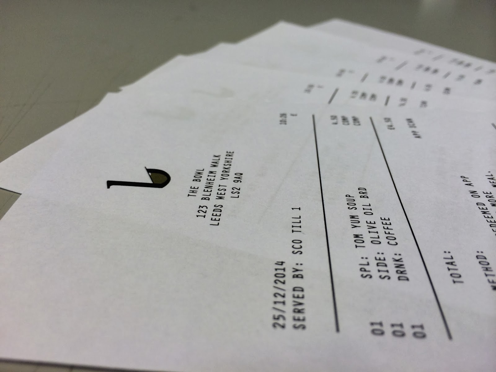


I think adding the thank you at the bottom was a good idea, it adds a personal touch to the receipt, a position notion, rather than a boring one.
I added the address to the receipt, so the customer knows which of the bowl's restaurants sold them the soups.
I thought it would be nice to include a photo of a screwed up receipt. As we know, the majority of receipts end up screwed up somewhere.
The full receipt looks fine, it's clean, minimal, which are consistent themes within the restaurant, and all it's stationary.
OUGD504: STUDIO BRIEF 3 - Design for Print & Web // Printing the Menu
Following the designing of my menu, I printed it. I chose a thick stock, something which would handle multiple uses, rather than a one off.


It was a very high quality print, it think it came out rather well. Below you can see a shot of the whole menu. It's easily navigate-able, the prices are clearly indicated. I think I achieved this with my use of font weights and types to establish a hierarchy.

OUGD504: STUDIO BRIEF 3 - Design for Print & Web // Receipt Designing
Whenever you make a purchase at any restaurant, or even, anywhere, you typically receive a receipt. As a proof of purchase, and for your records, if you chose to do so.

I mocked up some layouts to get an idea of how I would lay the receipt out. I wanted to include the logo and room for the pricing and method of payment.

You can see, again I've used a complex grid, to create some spacial awareness and assure that you can easily navigate the receipt, without confusion.

You can see the final receipt design. Pretty clean design, easily nav'd. Simple. I made sure these was some reference to the in-app purchasing system.
OUGD504: STUDIO BRIEF 3 - Design for Print & Web // Stationary Menu Design
As part of the printed collateral, I'm creating a menu. The menu is usually the first piece of print you'll get to see, hold and fell in any restaurant. I wanted to get the look of it perfect. Have a minimal sophisticated theme, which communicates the prices and the soups, solely.


I created some layouts, and I decided that the layout on the top far right would be most suited for what I need. It's clean, minimal and simple.

I used a strong grids system throughout designing the menu. The grids system makes everything look so much neater. It allows for proper spacing throughout. Overall, the menu looks far more appealing.

Finished shot of the menu, before it was printed. I'm really pleased with how clean looking it turned out.
Wednesday, 8 January 2014
OUGD504: STUDIO BRIEF 1 - Design for Print // Screen Printing Book Inners
For the inside of my publication I planned to screen print to the different colour modes, the metallics and the fluorescence. I exposed my screen a few days ago, so I could print during the drop in hours at Rossington Street's print room.

After a few test prints and experimentations I managed to slightly ruin my screen, a few specs of ink we coming through the screen, but it looked alright.

I managed to get around 30 perfect test prints, with a few experimentations too. Flawlessly, I decided to go for the print in the real thing. In short, this was a bad idea.

Somehow, the emulsion managed to stick to the stock, and rip the paper, whilst taking half the emulsion with it. It was quite a disaster. In a way, it does look quite cool, however it's ruined the stock, and the print on the other side, which I kind of needed.

As you can see, on the back the paper has thinned, you can see the previous page beneath it. It looks sloppy, and i'll have to re-do it for the submission. This could not have gone worse. I hate my life.
OUGD504: STUDIO BRIEF 3 - Design for Print & Web // Final Crit Feedback
Design for Print and Web critique, I presented my design boards, see above, and the few pieces of collateral I currently have printed. I'm current in the middle of getting things designed and printed, so nothing really looks finished or ready for presenting. However, that should soon change. From the critique, I received the following feedback:
Strengths
- Concept and Logo
- App - good options
Areas for improvement
- More drinks on menu and prices
- Spoons and cutlery ideas.
- Hot cup wraps for the soups
I'm planning to work on adjusting the menu, as it wasn't final, I need to add a large range of beverages. I'm not too sure how adding cutlery would work, I wouldn't really be able to brand it, so I don't see what it would add, really. The Hot cup wraps are a great idea, functionality and I can print on them.
Considerations
- Vinyl cutter - digital dungeon (try using it to apply branding to 3d items of collateral)
- Uniforms and other areas of branding for my proposal
- Propose stall brands for festivals and restaurants like trinity kitchen
- Website
I didn't think the vinyl cutter in the digital dungeon was worth using, however I've ben pursued to give it a try. I'm planning to include informs in my proposals, and the stall brands are something else I will include. I plan to create a mock up of a website for the digital proposals.
Tuesday, 7 January 2014
OUGD504: STUDIO BRIEF 3 - Design for Print & Web // App Design
Following the initial design of the app, I began creating the app, I measured the size of the standard iPhone 5/S/C screen. It came to 1134 x 640px. I used this as a base, I then marked off the areas dominated by Apple's UI, the status bar at the top.

I divided the remaining area into thirds and added the logo. To open the app, you must slide to open, to make this seem more like an Apple UI, I sent the blend mode to 'soft light', which altered the opacity, slightly.


I used the same background throughout, not to distract from the UI. Some apps in my research did this, and they seem to work well by doing so. I added a bar at the top of the page, for the rest of the pages. The symbol at the right will return users to the main menu. All the pages were designed using the rule of thirds as a basis.

The map works with apple maps. It uses your location to find nearby stores. I used the same grid throughout, and I've used breakers to separate the information. There's an arrow to indicate that a scroll is active, so you find the rest of the information.


The food-menu links to the other sub-pages for the food categories. The rewards page uses the logo as the bowl, the soup in the bowl fills up with every purchase, once the bowl is full, you get some soup, for free.
Subscribe to:
Posts (Atom)