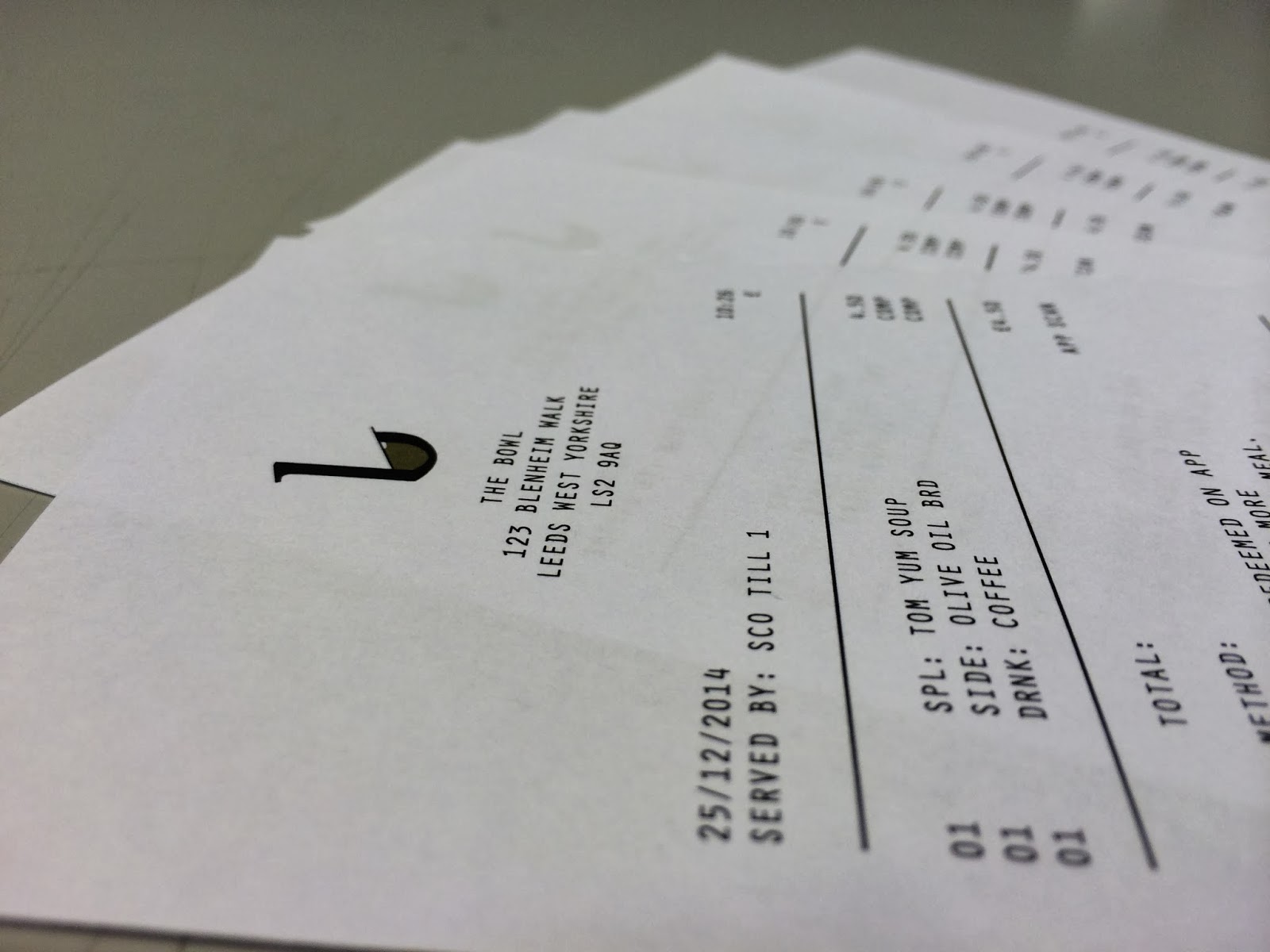
I think adding the thank you at the bottom was a good idea, it adds a personal touch to the receipt, a position notion, rather than a boring one.
I added the address to the receipt, so the customer knows which of the bowl's restaurants sold them the soups.
I thought it would be nice to include a photo of a screwed up receipt. As we know, the majority of receipts end up screwed up somewhere.
The full receipt looks fine, it's clean, minimal, which are consistent themes within the restaurant, and all it's stationary.


No comments:
Post a Comment