Tuesday, 29 January 2013

OUGD404: Design Principles - COLOUR - 20 Questions about colour


1) How does colour assist Hierarchy in Text? - It can be used within brightness or temperature, the more dominant colour takes power.

2) Max or Min amount of colour to use when designing? - There's no real answer, too many can look cluttered and two few 

3) How can I apply rules such as temperature towards my designs? 

4) What colour appeals to different audiences? Connotations? - Colours appeal to different emotions, blues for sadness etc. Also, gender segregation

5) Whats the best colour combination for body copy apart from black and white?

-

1) Why do colours force out complementary colours? - Seeing one colour, and having an effect of bringing about the complementary colour, the rods and cones in your eyes give you the optical illusion of it's complementary. Over exposure in the rods causes them to fatigue, and bring out the different colours around it. Red Green and Blue are already there, all the different aspects of contrast allows you to see them.

2) Simplest way to balance colour? - Photoshop Colour Balance tool. There's a ratio which can be found, which demonstrates and describes the percentile, for the amount of colour which can be used with another colour, for them to balance. The colour has a weight, and has different weights, you would think two primary would make a neutral, however, you may need slightly more of one colour, and slightly less of another to balance them out correctly.  

3) Is it always a case of contrast and tone + hue working together? - An appropriate contrast is easiest for the eye to see, and you rarely see low contrast colour balance. If there's a colour there, it has to have a tonal value, the only point in which tone itself is used would be in monochromatic tints. However, when you use two colours, hue and contrast are always working together, so yes. 

4) How many colours can one use? - No real answer, depends on the situation, it depends on the cost and client. A good designer can get away with using as many colours as they like, however there's a greater risk of using too many than too few. You can relate it to design, the more information you add to a field of vision, the more data, the more can go wrong, the more information that's there the more noise that's there interfering. Which goes against solving the problem between visual communication. You have to find a balance. 

5) If everyone perceives colour differently does this mean we perceive contrast differently? - If you view a colour differently, the contrast would be different, between that and another colour. However, if you're viewing the entire spectrum differently to the same level, the contrast will be the same. However, there is no way to see it, and it boils down to why people see colours differently, it could be due to colour blindness, or the impairment of the rods and cones in your eyes, not being able to see colours, you would rely on the tonal value of the colour, however, some colours can have the same tonal value, so they would struggle. However some people would view if differently for psychological reasons, or having more sensitivity to the eyes. People could also be untrained to view colour in the same way, having a lesser understanding. This can be combated with pantones, and you can see how things are, and compare their likeness. Colour is subjective, and we're not sure what people are seeing.

You're unable to control lighting conditions, there's no such thing as a light which is standard for things to be seen in. For example, in strong sunlight, which has a slight orange tint, the colour will be effected towards a warmer brighter light, and in colder areas with cloud cover. They light would be dimmer, they would be a blue tint to the light, which would effect how the colour would be received. 


1) How can these be applied to represent an ideal?

2) Which ideals with Graphic Design are appropriate for each type of contrast?

3) What would be an ideal solution to manipulate colour for an effect?

4) Is it better to be subtle or extreme with the manipulation of colour?

5) With type, would it be better to use contrasting hues and tones, or those which are similar?

6) In what effect can you use colour with layout for a specific, intended, response to your work?

7) Can contrast of extension be used within contrast of tone, i.e using the same colours.

8) Can contrast of temperature be using with contrast of tone?

9) How are colours with shine affected within tone?

10) How can I elevate the contrast of the effects?


Identify 10 things you need to know about Graphic Design, what're the 10 principles, the 10 things you need to know. Things which are vital, things which are essential. Text, image and examples. Reviewing and pulling together those 10 things. That we've been through. This will provide your content for what we're looking at next. Quotes, secondary research. Print it out.

Bring a magazine, no more than 5 each, that you can rip to bits, Thing about a range of design. Something crap, to something you respect. 

Monday, 21 January 2013

OUGD405: Design Process: STUDIO BRIEF - RESEARCH, COLLECT, COMMUNICATE: PRODUCT


As part of this brief we had to use out research themes and explore information graphics through one of the following outcomes:

  • Product and Publication
  • Product and Packaging
  • Product and Distribution
I've decided to take the Product and Distribution path with this brief, so I made the following spider diagram to explore some ideas. 


I find the idea of using a stamp, which would come with a booklet, similar to what you would receive in a welcome package, if you were to join a stamp collecting club. I went onto research some creative ways I can create the stamp rather than using one of Wright's sketches, renderings or a photograph of a complete building, in the present day.


Based on some of the stamp collecting booklets in my design context post, I decided to replicate the design for my stamps. Above you can see some mock-up sketches of booklets, some being a double spread and some being a triple, I also sketched a quadruple spread. (Separate Research Post

I felt that the double spread was too small to house the appropriate amount of information which I would like to convey, and that the quadruple would be too excessive. So i've decided to settle for the triple page booklet.


I drew up another quick design sheet on how I could lay the stamps out, with the text. I've designed it to accomodate 6 stamps, however, this may be subject to change. I designed it to be neat and readable, whilst being aesthetically pleasing. 

I then began works on the stamps, you can see on the product research page, I've decided to imitate the style of DeviantART user shoelesspeakcock who is a geometric vector artist, based in the United Kingdom. I've used lines and shapes, tracing over an image of Wright's drawings or a photograph, from one of his schematics books. 


You can see how it was done in the image above. I tried to seperate the colours based on different materials, natural vs fabricated, textures and their angle in relation to the sun (how shaded they were) I continued the process for 5 other of Wright's works: Sea Cliff, Trinity Chapel, The New Theater, Lake Thahoe Summer Colony and Play Resort and Sports Club.

Once I had completed all 6 of the geometric-vector tracings, I begun work on the stamp. To create the perforated edges,  i had to use a set of advanced processes, which I've never done before.


First I added a new layer, and created a shape which filled the page. It's worth noting that the page is A3 size, in height, but had the dimensions of the stamp. I then added a stroke around the shape and styled it like you can see above. 


I want to subtract them from the shape, so I had to transform the stroke into an outline. I opened the 'Flatten Transparency Window, and made sure the 'Convert All Strokes to Outlines' box was ticked, and I then pressed Ok. This now means the strokes are treated a shape objects. 


I then wanted to cut stroke-shape from the shape below, to do this, I found the Pathfinder window, and switched the shape mode from normal to subtract. This subtracted the stroke from the edges, and created the perforated edge look, as you can see below.


I then changed the inside colour to a charcoal grey, this contrasts nicely with the colours used on the stamp designs, and the edges, bringing them out, using the contrast of hue, saturation and tone. 


Similar to the style of Shoelesspeakcock, I added the Queen Elizibeth silhouette-like image in the top right hand corner of the stamp. In the top right hand corner, I've added the name of the building and the date it was constructed. I used the colour picker to draw out colours from the image, and use them in the text, for the sake of continuity. I also added the 1st in the bottom right, I noticed that in most stamps used, regular stamps with a numeral, rather than a digit. I used white for the Queen's head and the '1st', as it's using the limited 3-colour-scheme. Below you can see all six finished stamps, click to enlarge. 


Friday, the 18th of January, I was involved in a crit, where I was recommended to use some of Wright's schematics in the layouts, for the booklet as guides for the text and images. This seemed like a great idea which I really wanted to explore, but looking at some of the schematics, they're extremely complex, which hundreds of lines, unfortunately, this would not be practical for this project. However, I will keep this idea in mind for future projects.


Above, are two more designs I've sketched up for the booklet, these ones are evolved versions of the sheet featured at the top of the post, using the three-page-layout system. I've also added a page in, on which I plan to incude information about Frank Lloyd Wright. On which I've included a silhouette, the outline of Frank Lloyd Wright. With this, it almost relates to the Queen's head on the stamp, and rather than adding an image or drawing of Wright, I think using, essentially a geometrical vector shape, links to the illustrations on the stamps.

Also, in the lower layouts, you can see I've added bars running across the top and bottom of the page, this breaks up the page, the design above it, without the bars looks very full, so adding them, and not overlaying them with text makes the page look much more minimal, with a more modernist appeal to it. And after all Frank Lloyd Wright was a modernist Architect! 

I've decided to produce six booklets, the reason being that the centre page, in booklets, contains information on one of the stamps, and the building it represents. So, to accomodate all the images, there must be six booklets. I then went to create the booklet on Adobe InDesign.


You can see that I stuck closely to the lower layout on my design sheet. I used the blue, from the stamps, for the bars, and I've used the orange on the F.L.W Silhouette. I happy with how the design turned out to look. I think using the design with the bars was the best way to go with the booklet, it doesn't overwhelm you with text, I think it looks appealing and manageable. 


Above you can see the printed versions of the designs. You can definitely tell that I'm working with a limited colour set, and i think it's effective. I think there is a good balance between visuals and copy, you're not overwhelmed with images, or with copy. 


Here you can see all the products which will be distributed. Six booklets, with their accompanying stamp. I also noticed that the Orange works quite well with the blue, they're contrasting, but because they're both fairly neutral colours in terms of saturation and brightness, they don't contrast too much.


A close up of the stamps, sadly these weren't done in digital print, unlike the booklets, but they still look okay. To create the perforated texture you get when you hold stamps I used a scalpel, stabbing it into the circles created by the edges, this teamed with the printer paper gave the effect of perforated stamps. 


I'm extremely happy with the quality these printed out, in the digital print room. I managed to print the double-sided, using the PDF export techniques which I learnt in a Photoshop, being able to combine the files in Adobe Acrobat Pro, reducing the file size, whilst maintaining the quality for print. 


Tuesday, 15 January 2013

OUGD404: Design Principles - COLOUR: Part 3 - Colour and Contrast


Contrast of Tone
  • Formed by the juxtaposition of light and dark values. This could be monochromatic. 
  • The Rods in your eyes differentiate tone. 
  • Monochromatic is the tone of one colour, not just greyscale. 
  • In greyscale, the primary colours are the lightest, the darkest and the mid tone, when the colour wheel is desaturated.
  • Tonal Spectrum, white round to black.
  • White and Black on 50% are equally legible, even though the contrasts are extreme, as they're both the same distance from 50%.
  • The same principle can be applied to colour. (Example, Red on Orange)
Contrast of Hue
  • Formed by the juxtaposing of different hues. The greater the distance between hues on a colour wheel, the greater the contrast. 
  • On a white background, blue would stand out the most, as, seen in tone, it's got the darkest value. 
  • On a black background, yellow stands out the most, as it has the lightest tonal value. Red almost blends in, as it's the mid tone. 
  • Use black and white very carefully in Graphic Design, as it cancels out colours.
  • High contrast colours, RYB, when placed together all fight for attention.
  • The contrast of hue and tone are having an impact on our ability to read words.
Contrast of Saturation
  • Formed by the juxtaposition of light and dark values and heir relative saturation.
  • Grey background with blue on, we would say the blue shape is blue.
  • However, when we add a more saturated blue, the original blue shape looks let saturated, and not really 'blue'.
  • This process can be repeated, contrasting more and more, until we get the primary blue, absolute blue, and the rest become very desaturated, looks paler, greyer, duller. etc.
  • The same process can be applied to other colours, and tints. (for example, adding white)
  • Contrast of Hue, Tone and Saturation, all work in this sense.
Contrast of Extension
  • Former by assigning proportional field sizes in relation to the visual weight of a colour. Also known as the proportion. 
  • Assigning different subjective values to colours, certain colours have certain weights.
  • Blue would appear the heaviest, as it's the darkest, Yellow would appear the lightest, as it's the lightest, and Red would be the mid tone. 
  • We have have less Violet, and more Yellow to have a visual balance. 
  • In relation to this, we can have less Yellow and more Violet, and we see a stand-out balance.
  • If we talk about imbalance, one of this colours is going to jump out. (see slides)
  • Using stripes of violet creates an imbalance, and it's easier to look at a block of violet. 
  • However, then these stripes are spaces out across a bigger area of yellow, your field of view increases, and it become almost easier to look at.It affects our ability to see those colours accurately. 
  • Hierarchy - spacial quality also applies, as it would with type.
  • High contrast colours, always, jump out at you. 
  • Small amounts of colour, with large amounts of colour work better. Don't use the same amount of colour. 
Contrast of Temperature
  • Formed by juxtaposing hues that can be considered "warm" or 'cool'. 
  • The warmest colour would be something which sits in the red-orange area
  • The coolest would be in the blue-green area.
  • In-between we have colour which movie from the warm to the cool, and vice-versa, on both sides. 
  • Taking a mid red and pushing it towards violet, you're making it cooler. 
  • However, this makes the red look more orange, making it look warmer.
  • If you add a more orange red, it makes the original red look cooler, and the violet look even cooler.
  • However in contrast this makes the orange look warmer. 
  • The middle section, which is a flat colour, appears to look like a gradient (see slide)
  • If you place colours of the decreasing temperature, next to each other in a gradual pattern, it looks like a gradient. 
  • We can see the (above) colours are separate colours, with black bars in-between them, but when the black is taken away, it's a gradient. 
Complementary Contrast
  • Formed by the juxtaposition complementary colour from a colour wheel of perceptual opposites. 
  • Red and Green are complete opposites on the colour wheel, and putting those two colours together looks almost painful.
  • Desaturating the blue and the orange in this image, and it becomes a complementary contrast, these two colours are fighting of attention.
  • Yellow and Blue and equidistant from the green so when Yellow and Blue stiles are applied, they look better. However, Blue has a similar tone to Green than Yellow, so it's easier to look at.
  • If you invert the background, the blue becomes difficult to look at, the the Red becomes calm, it's not fighting for your attention. 
Simultaneous Contrast
  • Formed by the boundaries of colours which perceptually vibrate. 
  • Bright Yellow, with Bright Green ontop of it.The longer you stare at it, the yellow begins to turn slightly more orange.
  • When you put certain colours next to each other, they start to vibrate.
  • Putting Yellow on grey, there's a hint of violet, then with blue and grey, there's a hint of orange. 
Fred's 'Mind Blow'
  • Having Yellow on Violet works, however, it doesn't always work in reverse. 
  • Having a small almost of Yellow on Violet works, but not when uses repeatedly.
  • Yellow is trying to impose it's complementary on our field of vision, to stand out the most.
  • However, optical illusions, putting the same colour on two different colours, makes the original colour appear to take the form of stop different colours, based on the simultaneous contrast.
  • Using background the make the foreground appear differently. However, if they're joined together, you can see that the colour does not change. 
  • You can also, by staring at a black dot, burn an invert of the surrounding image onto your retinas. 

Itten's 7 Contrasts

Red Envelope
  • On Yellow: Darker Tone, Different Hue, More saturated, Warmer temperature, High extension, not much of a complementary contrast, slightly blue background
  • On Green: Darker Tone, Different Hue, More saturated, The red looks warmer, in comparison, high complementary contrast, blue fade on the green.
  • On Red: Darker Tone, Similar Hue, more saturated, It looks warmer, and the background almost goes towards a violet colour, whereas the envelope goes more orange, Low extension contrast, low complementary contrast, as they're the same colour, more or less, it makes the area around it look violet. 
  • On Orange: Darker Tone, different hue, however, it's not too substantial, around the same saturation, 

Thursday, 10 January 2013

OUGD405: Design Process - Research, Collect, Communicate: PRODUCT


As part of this brief we had to use out research themes and explore information graphics through one of the following outcomes:

  • Product and Publication
  • Product and Packaging
  • Product and Distribution
I've decided to take the Product and Distribution path with this brief, so I made the following spider diagram to explore some ideas. 


Sunday, 6 January 2013

Design Principles: STUDY TASK 2 - The Birth of a Font

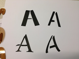
To begin with, for this task, we had to create hybrid letter forms from existing letterforms. We did this by gathering Ab Bb and Cc from a Gothic, Roman, Script and Block font. We then disassembled the fonts, as you can see below, and we begun to reconstruct them in every combination we could think of.


I begun with taking a specific part of each letter form, and rotating it around the four, so it appears on all 4 of the letterforms, and repeat.


Lowercase 'a'


Uppercase B


Lowecase 'B'