Monday, 18 March 2013

OUGD406: Design Practice 1 - Speaking From Experience


This is another live brief, and the final product of this brief will be given to the new first years in their first week, you can see a copy of the brief which we were given below. 


For friday, the 22nd of March, 3 boards, one with a concept, one with a method of delivery and one of with production. Boards are to be no smaller than A3 size, printed off. 

Audience: New 1st Years, 18-25. Typically, confused and overwhelmed with power point presentations.

Concept: For the content, I'm interesting in providing the recipient with useful information to optimise their productivity and methods so they can create a high quality standard of work slightly quicker than the conventional methods, with more efficiency. For example, I would recommend apps for their macs which would act as a note book, for examples Evernote, which is a notebook app, it stores and categorises your documents in a clean and easy to navigate format, which separates your notes into 'notebooks', which you can tag for ease of search. They also work well in sync with other Evernote apps on other user interfaces, such as iPads and iPhones, incase you're caught short without your Mac. The advantage to working with this app above direct blogging would be that this app works well offline, so you can pull up notes in wi-fi dead zones and has a nicer interface. You can copy your notes over to blogger simply using the copy and paste tools. You can also share your notes to Twitter, Facebook or LinkedIn and you can e-mail them. I could essentially review them and says specifically how they can be applied to optimise efficiency, and show the audience, the new first years, briefly how to use them.


This part of the module will have an massive effect on the module grade, this needs to be good, and it needs to look like Graphic Design and you need to think about production. 

Method of Delivery: Following my research on my design context blog, I've decided to create sleeve which will hold all the information in, which consists of a small dictionary in book format and 3 flyers. One, which congratulates and welcomes the new student onto the course, one which provides the new students with the app guide and the final one, which is the tips guide. You can see a concept sketch of the sleeve below.


For the first crit, on friday the 22nd of March, before we break up for easter, we were asked to produce these research boards. One which defines the concept, what we want to communicate and why, the second, states our method of delivery, how we plan on delivering our message, for me, that is a sleeve with the flyers, leaflets and book inside it, as you can see in the design sheet above. The third sheet is Production, how we plan on creating our method of delivery. For me, I plan on binding the book using strings of fiber, and thread to hold it together, and cardboard with cloth over the top for the front and back cover. 


Following the feedback from the crit,  I've decided to narrow down my concept, into just creating a Graphic Design Terminology Dictionary. Which will contain the words which are used in the studio and within the industry. To help the first years progress and learn and be able to reference the terms easily, when needed.


Above, you can see the concept design for the book. It will either be bound using a sewing method which I've mocked up, you can see below, or a perfect bind method. 


I began by creating three sets of four sheet of paper, folder and stacked like this. Piled the sets and compressed them under books for 24 hours. To decrease their size as much as I can, and almost solidify the folds.


I then begans to sew the paper sets together using this method, which would create this bind below, on the inside of the book. 


I then compressed the binded book for another 24 hours, as you can see below. This would seal the bind, and allow it to set within the books. 


It then produced this, as the final product, after adding some black card around the edge to cover the binds of the book, and make it look alot nicer.


I think this is a nice alternative to using a staple bind, and i'm glad with how my first attempt came out. However, to achieve a more professional look I'd have to go with a prefect bind, with a hard cover on the edge. 

Since i've got the method of production sorted, I've begun to focus on layout and colour/type selection. I quickly mocked up some thumbnail sketched of how I want the spreads in the book to look.


I wanted to have a large feature type in a heavy block colour to draw the attention of the reader. Then using body copy to allow the reader to learn the definitions. 


Above are some larger layouts which communicate exactly how I'd like them to look, as they're in 1:1 scale. 


Tuesday, 5 March 2013

OUGD406: Design Practice 1 - Communication is a Virus


Attached is the brief, the subject of which is to create a form of viral communication.

We were given the topic of 5 A Day

We must consider the following within our work:
  • What do we want to say?
  • How do we want to put it across?
  • What language and tone of voice would be considered appropriate?
  • Will this brief's response be composed entirely with type?
  • Will it be with image?
  • Or will it be a combination of the two, working in unison?
  • What is our goal? 
    • To inform?
    • To Educate?
    • To divert?
    • To Persuade?
    • To Challenge?
    • To Offend?
  • Who is the audience?
  • Will it be interactive, or encouraging someone to change their lifestyle?
We also must remember what we are working to a limited colour set, which means two colours, with the addition of stock.

Following initial brainstorming, as you can see in the image below, we originally decided to orientate our work around social networks, by listing a huge amount of them, to determine which ones we use the most, which ones we use the least, which ones are the most popular, or addictive. We've been able to establish that people spend far too much time on social networks, and the majority of the content submitted to these sites are usually mindless dribble, which bares no use for anyone.


Wallpaper Designs.

For part of this project, I've undertaken the role of designing the wallpapers for mobiles, tablets and monitors. Which, will be e-mailed to Tom, the course admin and he will distribute them across the courses in the college. I will also upload them to the web and send people links to download the wallpapers. In an attempt to promote the Twitter Account. The wallpapers must feature the logo, which is the recognisable character, the face of Tweet5 and the Twitter name, which is @Tweet5_ 

Study into Resolution and Screen Size. 

First, I want to learn the resolutions which I will need to work at. Retina displays, which is a very high quality display, are coming into effect in most of the new products which are being released. That is the minimum standard I wish to work to. The DPI of retina displays is 264, as opposed to the preset screen resolution which is 72 DPI, which is an extremely high quality standard of image, almost as much as the standard print resolution, which is 300 DPI. I imagine, I will work at 300 DPI and export the image in the appropriate resolution, 264 DPI, this way I'll be able to print the images in I need to for crits and the final module submission. 

Second, I will need to learn the sizes of screens, which greatly variate. At a glance, 90% of the people who work in the same studio as me, a combination of 1st and 2nd Years on BAGD, all use MacBooks or iMacs. The sizes of the MacBooks range from the 13 to the 17 inch models, however the majority are the 13 and 15 inch models, with only one or two 17 inch MacBooks. The iMacs in the room are all the 21.5 Inch models, without a retina display, so based on my study research, their DPI would be half the retina display resolution, which is 132 DPI. However, I will still create the Retina Display Resolution versions for those who have their own newer iMacs out of College. They other size which Apple offer is the 27 inch iMac - I will cater to both. The 21.5 inch iMac has a 1920x1080 resolution and the 27 inch has a 2560x1440 resolution. The 13 inch MacBook Pro has a resolution of 2560x1600 and the 15inch MacBook Pro has a resolution of 2880x1800. I have decided not to create a background for the 17 inch MacBook Pro, as they're no longer in production, and hardly anyone has one anymore. The Retina Display iPad by Apple is has a Resolution of 2048x1536 

OUGD404: Design Principles - Submission/Examining Work


Submission Deadline 17/04/13, at 12pm in Studio 4.

Which means there is 7 weeks until hand in, inducing this week. 

Submission Requirements
  • Blog with workshop tasks etc…
  • Thumbnail layouts (strong collection)
  • Enlarged and scaled thumbnails with rough measurements
  • Traditional mark-up with margins, guides, grids, size, etc…
  • Digital mark-up.
  • 10 double page spreads or booklet format (content will be made up of 10 things)
  • Consider printing method, format, final outcome
  • Time
  • Design and Layout
They don't all have to follow the same format, they can be different, or similar, it's entirely up to you.

Stuff to know and Find Out
  • What are grids, columns, gutters and margins?
  • What are sub-heads, paragraphs, captions and ligatures?
  • What is DPS and what does it do?
  • What is golden section?
  • Explain why rulers, boxes follow number and drop caps are? What are 'picas', points, and pixels?
Designers to look at, who use Grids

Friday, 1 March 2013

OUGD404: Design Principles - 10 Things you need to know about Graphic Design

Design Context Entry


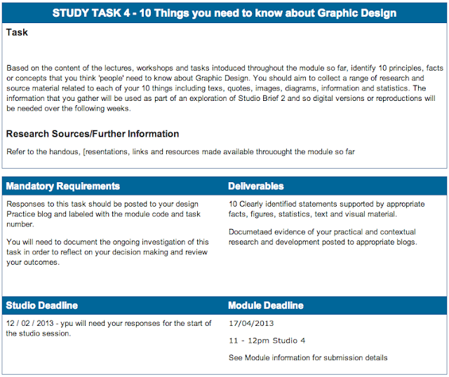
Above, you can see a screen shot from e-studio of the task, this contains all the details and information we need to know to complete this task, which will all be undertaken, ongoing-ly, within this post. 
  1. There are two colour modes
  2. Colour is complex, using less is a safe solution.
  3. Relevance of Pantone in Design.
  4. The arrangement of type is important.
  5. Less is best within typography
  6. The contrasts of colours can lead to grand effects.
  7. Always consider cost when printing, limiting colours can help lower the cost of printing
  8. Type can be manipulated for effect
  9. There are 4 types of fonts
  10. There is a difference between legibility and Readability 

1. There are two colour modes, RGB (Red, Green and Blue) and CMYK (Cyan, Magenta, Yellow and Key (Also known as Black)) RGB colours are for screen use only, such as digital art, design for web or design for film. RGB is also an additive colour mode, additive colour mode means when the red green and blue are layered they create white. In contrast to this, CMYK is intended for print, as apposed to digital - traditionally, in any standard printer, there are 4 ink cartridges: Cyan, Magenta, Yellow and Key. When these colours are applied together, they create black, rather than white, which means they are a subjective colour mode. 

2. Colour is complex, not only are there two colour modes which were previously mentioned, there are also different types of contrast which you need to take into consideration when selecting the colours you wish to use in your work. There is Contrast of Tone, Contrast of Hue, Contrast of Saturation, Contrast of Temperature, Complementary Contrast, Contrast of Extension, Simultaneous Contrast. These are all explained in detail in the blog post from the session, Design Principles, where we learnt about colour contrast. Because of the amount of contrasts you need to take into consideration, some designers opt to remove colour from their designs completely, as it makes life much easier. 

3. Pantone is a system used within Graphic Design to communicate a colour exactly to a colleague within the industry. It works be having a code for each number, this code can be used internationally. So you can have the exact colour you want printed. There are also pantone referencing charts and books which you can use to detect the colour on a piece of work.

4. The arrangement of type is important, as well as the typical font size which we use, there is also various other aspects to type which we need to consider when you're working with type. There's leading, which comes from the stripes of lead which were used to separate type vertically, and it means the space between the lines. There's also kerning, which means the space between each letter, which should be lower with a smaller point size, and larger with a larger point size. 

5. Less is best within typography, when using fonts within your work, you do not want to use a full set of fonts. Limiting the amount leads to a much more aesthetically pleasing piece. Also, as a rule of thumb, it would be wise to limit yourself to selecting the three fonts within a typeface, which is a selection of fonts. For example, the Helvetica typeface contrains many variations, such as Helvetica Black, Bold, Semi Bold, Regular and Italic. 

6. The contrasts of colours leads to obscure effects, the was the optics in the eye perceives colours next to each other allows one colour to manipulate the appearance of the next, in comparison. For example, using contrast of tone, you can visually make a colour look lighter by placing a darker toned colour next to it. You can then make that colour look darker by placing another darker colour next to the second colour wich subjectively makes the original colour much lighter. To make the original colour look darker you can place a lighter colour next it, which will subjectively make the colour darker. 

7. Printing is expensive, you should always consider the cost of printing when you're designing. The method to reduce the cost of print lies with colour. Colour is separated into 4 colour plates, Cyan, Magenta  Yellow and Key - typically. Logically, to use a combination of all these colours, you would have to use all the plates to print. However, by creating a colour which only uses 3/4 plates, you'll only be paying 3/4 of the price. This is explains why, when you see mass produced works, alot of them are in monocrome, which is just one colour, for example using pure magenta.

8. The manipulation of type can be used within your design work, type manipulation is often used in logos. To do this you need to understand the anatomy of type, a diagram can be found below which explains the names of the different proporties on letterforms. For example you could incorporate a shape into the counter of a letterform, or perhaps extend the ascenders or descenders. You could even remove some of the less distinct parts of the letterform, leaving only the pure character of the letterform, so it's still recognisable, for effect.

9. There are 4 types of type, there are Roman, Gothic, Script and Block. Roman fonts are typically fonts which look quite formal, they're characterised by their traditional serifs. Gothic fonts are typically very clean without serifs, following the moderns form following function. Script fonts often resemble handwriting, they're very stylised and can look effective in traditional style pieces. Block fonts are often extremely thick weighted fonts, which are mainly used in headers. However, after experimentation, you will find that

10. There is a difference between legibility and readability. Legibility is the degree which individual glyphs (letterforms) in text are understandable and recognisable based on appearance. Whereas readability is the ease which the text can be read. This is influenced by line height, primary and secondary leading, justification, type style, kerning, tracking and point size.