Wednesday 30 April 2014

OUGD501: STUDIO BRIEF 2 - Theory Into Practice // The concept

I've begun to flesh out a new concept, following a small critique I took part in with a few members of the group - which I'll explain here. I presented the ideas displayed in previous posts, also mentioning I had context but no content to the idea. Which didn't make it very feasible.

Instead taking a product and re-marketing it based on the themes and ideas of consumerism. For example, re-packaging a fragrance. The fragrance is something which receives heavy treatment from consumeristic tendencies, the majority of ads for fragrances offer celebrity endorsements and other means of manipulation through association. The fragrance is marketed to be the tool which transforms the consumer into the celebrity endorsing the product. 


I mapped out ways which I could rebrand a product to follow the consumeristic tendencies, I also discussed the types of products which I could re-market. So I have an idea of what I'll want to create. 

I felt like repackaging a fragrance would be the way to go with this project, as fragrances are all but scents, nothing major. The fragrance I would package would just be water in a glass (or plastic) spray bottle. The packaging and promotion would be where I implement the themes of consumerism. 

The plan is to create packaging which has been designed to make itself look larger than it actually is. Almost like a penis extension, against the other products. Like size matters. 


The sketch above shows how the packaging would work, leaving space about the product, which isn't needed, only to make the product appear larger than it actually his, in hope that this would translate to the consumer's mind that the product would have similar effects to their 'manhood'. Amongst the other products. Size matters. 

I then mocked up how I might like the packaging to look, so I know if it would be feasible to create when printing. 


I sketched out a net, based on some initial research I had previous undertaken, I would say this is the most basic of nets. 


I adapted the top half so it was 2mm wider, in every direction, that the lower half, so the two sides slide seamlessly together, without issue. The flimsy material which I mocked it up from compromised the design and manufacture of the packaging, but the real version will be printed on thicker stock, and perhaps even reinforced with mount board, or similar. 


The twos sides, which have been separated, they are of equal length, but the stopper in the top half prevents them from closing fully. 


OUGD505: STUDIO BRIEF 2 - An Exhibition of Aston Martin // Planning Collateral and Questions

We had a studio session with Lorraine today, covering some quick exercises to improve our approach to studio brief 2. To begin with, we were asked to write a list of somethings we were unsure of, within this project. Questions we wanted to ask about our briefs, things we needed to know to help us progress forward. I wrote the following;
  • Is the scale, and the amount of collateral I want to produce too much or too little?
  • Photography of illustration? For the tickets, brochures and other Aton Martin event collateral.  
  • Roman of Gothic fonts for the typography? I'm not sure if I should use a traditional Roman serif font, to keep the 'English Heritage' aspect of Aston Martin, or use a modern Gothic font, something like Helvetica, but not Helvetica, probably Open Sans, to bring the brand into 2014, as the company is 101 years old, the technology has moved with the time, is it time to modernise the type?
  • I'm unsure of the logo to use. Keep the existing logo for Aston Martin or create a new one specifically for the event? Or should I perhaps use a combination of the two?
Questions others in the group asked (which I think would be useful to me);
  • Is my target audience refined to it's full extent? As in, is it specific enough? or is it too specific for it's context?
  • What should be my final full range of products? It's important to know this, so you know exactly what you need to create, perhaps planning and rewriting the brief, so you know exactly what you need, would be the way to achieve this.
  • What stock should I use? 
  • What colour scheme would be appropriate? Research into your audience/content to find which colours work the best for your brief.
  • Is all the collateral 100% essential? Figure out what you can do in the realms of possibility. 


We were then asked to get our briefs for this project, which we had written ourselves, and underline the words which were important to the brief, as seen in red above, and the words which were 'fluffy', undefined and unnecessary, words which didn't really have direction.

What's important about this brief?
  • 101 years of Aston Martin, sophisticated design and engineering. Celebrating the company.
  • The audience primarily consists of 18-25 year old, males. Often with familes, from upper middle class backgrounds. 
  • Educational, tasteful tone of voice.
  • The scale and location of the event.
  • Branding and Promotion.
The penultimate thing we were asked to list was some things we wanted to learn in our final three weeks here in second year. This would form a to-do list of things we need to do before we leave. Something to push for in this project. I listed the following;
  • Make some packaging from scratch which looks decent and works, performing it's intended function. Serving a purpose.
  • Use a larger range of colours within a project. Too often I'm working with one or two colours and stock, studio brief 1 for example. I want to see how I work with a larger colour scheme, to see how it benefits the design of the event. As an underline part of the audience is families. 
  • Experiment with 4D design, time based design, perhaps as part of the promotion within the project, something to attract members of the public to attend the event I will be proposing.
  • Use design boards more effectively. Critiques for design boards are essential, and they are the, usually, the only thing the client or competition judges will see, so they have to be impactful and work to communicate the concept, whilst also looking good.
  • Time management. Being able to balance the time I have, assuring all the work get's done on time. Even taking time out to relax, some down time to reset your mind, and come back to the work with a fresh perspective. Lorraine recommended working for 10 minutes solid, without doing anything else, then checking e-mails or whatever, and repeat. 

Final chunk I promise. We were asked to rewrite our target audience based on some of the questions we've already thought about. It might not change a huge amount, some small extra adjectives perhaps to extend the definition of who we're catering for.
Eighteen to fifty year old males, upper middle class background, average earners. Often with families with children. Above all, with a large interest in cars, speed and engineering. They would love to own an Aston Martin, or a similar grand-tourer/super-car, however they are unable to afford one. This event is their gateway to exploring and engaging their childhood dream, of driving and seeing these cars.
Based on the tightening of our audience, I thought I should rewrite the desired collateral I would like to produce, and define how the audience would engage with it. Below is a mind map of various areas I would like to explore. Obviously, due to the time constraints which have been placed upon us,  I will be unable to create all of the collateral, but I would like to create at least 80% of it.


Tuesday 29 April 2014

OUGD501: STUDIO BRIEF 2 - Theory Into Practice // Mapping out ideas

I've begun to address this brief the traditional way, mapping out some initial ideas, which I will then go onto research in depth. I'm really not sure which direction I want to go in for this product. I know the underline themes which I want to undertake, that of consumerism, marketing something completely pointless by tapping into the hidden instinctual desires of the human, all that Sigmund Freud stuff. 


I began to flesh out the ideas of marketing the hidden needs, and methods of doing so. Throughout my essay for studio brief 1, I pulled the focus of the study to the male image, or the envy of, to promote and sell a product. Such as a watch or even a fragrance. The model is usually appealing to women, which men are able to recognise, something they want to achieve themselves, as part of the hidden instinctual desire for sex. Thinking back to a documentary I saw recently, 'Bigger, Stronger, Faster', which follows Chris Bell, who talks about steroids in sport. A segment in the documentary exposes a fitness model, who promoted a product he used, and attributed his physique to the product. Whereas, he has actually been taking anabolic steroids and growth hormones, the real reason for his unique physique. 

Thinking this, I thought I could market a product using a body builder who attributes his success to a product, which no one needs. 


I then drew 


Friday 25 April 2014

OUGD505: STUDIO BRIEF 2 - An Exhibition of Aston Martin // Primary Research - Car Fest North

As part of my research for studio brief 2, I'm looking in to similar events, to see what's already been done, if it's good, if it's bad, what works, and what doesn't. So I'll know what I should apply to my own branding and identity within this project, if appropriate and relevant to my audience. 

I'm looking at Car Fest, hosted my BBC Radio 2 DJ, Chris Evans. I was able to attend the 2013 North Festival, which was held at Oulton Park circuit in Cheshire. 


The carfest logo, it's the same every year, although the date usually changes on it. The style of illustration used really reflects what the business is about, as it is for Children in Need, so the illustrative style works for the cause, as well as the target audience for the attendance, which is families. 


As part of Car Fest's branding and collateral, they produced wrist bands. The wristband shown is the weekend wristband. It's crafted from a plastic coated gloss newsprint, which is extremely durable. The day wristbands were a different colour, and made from card, rather than plastic coated newsprint, as they didn't need to be as durable. Since the event doesn't really have a set colour scheme, other than vibrant colours, so they're able to use a large range of colours to separate the wrist bands, depending on their meaning. 


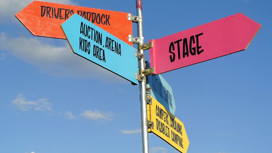
The signage around the event also follows this trend, sporting bright colours and a fairly relaxed hand-written style font. The colours used within this are used across the band and within the logo. 


The cars featured at car fest were lined up and displayed, a huge number of car manufacturers brought dozens of cars.


Wednesday 23 April 2014

OUGD503: STUDIO BRIEF 1 - Individual Practice // No. 7 Antiques


OUGD503: STUDIO BRIEF 1 - Individual Practice // Yoke

OUGD503: STUDIO BRIEF 2 - Creative Partners // YCN Champneys


 The Champneys Individual Boards

 The Champneys Collaborative Boards

OUGD503: STUDIO BRIEF 1 - Individual Practice // OAC Photography


OUGD503: STUDIO BRIEF 1 - Individual Practice // D&AD Npower