Thursday 29 November 2012

OUGD405: Studio Brief 1 - Research into Charities

For this part of the module, we were asked to research into a specific field. To do this, we were split into groups, and we were given a topic into which we would research. We were given Charities. In the groups we were put into, we each decided on a specific theme to research within our topics. The theme I've chosen to research is the finical distribution, i.e. what percentage of the donations go to the cause, what percentage goes on business expenses, and other costs.

I e-mail out the question to several charities, such as Oxfam, Cancer research UK, NSPCC, Unicef and the RSPCA. After being bombarded with a series of confirmation messages, that they have indeed received my e-mails. I finally received a real response from Oxfam.


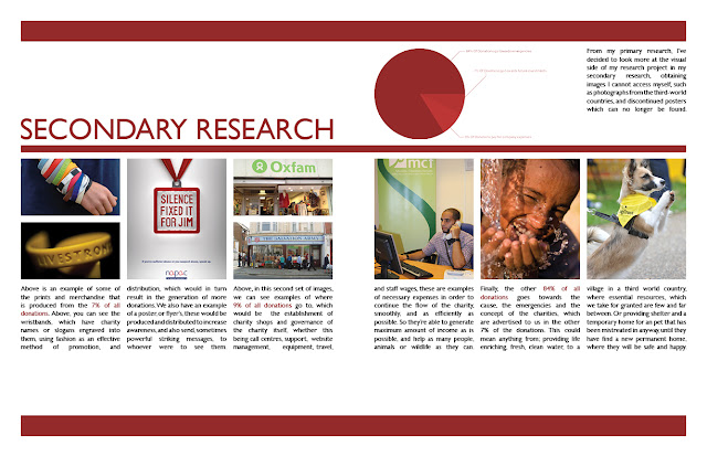
As this is, currently, the only response I've received, I'm going to have to base most of the research from this, as an average. In the e-mail, Oxfam uses a £1 as an example, 84p of which goes directly to emergencies, by this I assume they mean that 84p of the £1 goes to the cause, in this case, third world countries, who's population are in poverty. 9p of the £1 goes to business expenses, I imagine this would be establishment costs, wages and other general business related expenses. 7p of which goes to future investments, this would mean advertisements and campaigns to generate future income.

Following this, I went out into Leeds and took some photos of things which could be considered as 'the 7%', as seen in my primary research sheets.


I then took to the internet and found images, which I couldn't find in my location, that represented the three sections of the pie chart, as you can see in my secondary research, below.
I then decided on my direction, where I was going to take my research.


Saturday 17 November 2012

OUGD403: Studio Brief 3 - Message and Delivery (Post Crit)

Following the group crit, I've begun to make alterations to my mail shot, below is an extract from my post-crit analysis on my PPP Blog, which you can see here.
"Firstly, most importantly, is adjusting the variables to fit the brief, the sizing of the mail shots is wrong, it should be 220x110mm, mine is not. The original document in Illustrator is the correct size, however, due to the printer size adjustments and the crop marks being squeezed on the page, the mail shot as reduced by around 1-2cm, which I didn't notice. I'm pleased this was pointed out in the crit, otherwise I would have not met the criteria asked. Another error which was pointed out is the colour balance, in the illustrator file, I use two different shades of blue, and their half tones.  However, due to a printing error, again, some of the colours appear purple or grey, not looking like a half tone of one of the original blues, so, I must make this more clear in the improved mail shots. Another adjustment which needs to be made involves the sonar wheel, which can be found inside the leaflet, although I think this is a nice concept, It is hard to achieve, and it didn't work effectively. It was flimsy and it made some of the text hard to read, I also had difficultly obtaining appropriate split pins, so the ones I ended up with had a glittery texture, which do not fit the theme of the mail shot, so I'm going to remove it and only use the text under the sonar wheel.
Another dilema, I'm not longer able to access the digital print room, which means I'm limited to A3 paper only, so, I'm going to have to alter the fold of the page, so it fits on A3, rather than having a vertical crease, so it folds out horizontally which would exceed the page size, I'm going to have to have an horizontal crease, so the page folds vertically."
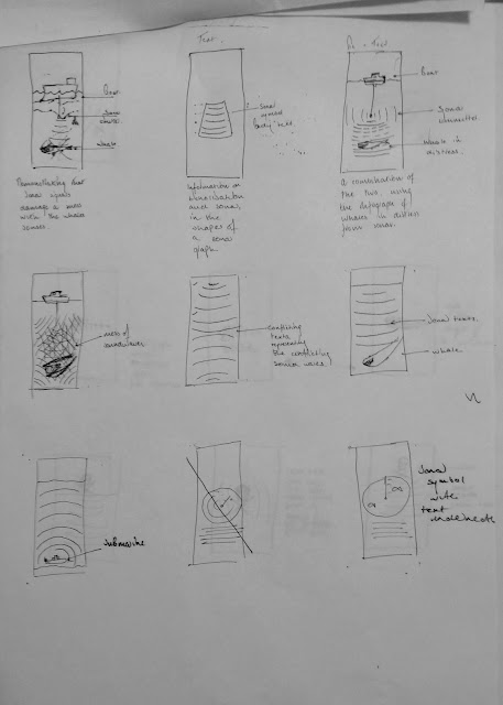
So, i've begun by sketching some new layouts for the altered design of my mail shot, in which I've accounted for limitation in size for the print.


I've decided that the bottom design would work better, as the top one looks rather basic, and it layed out in a rather odd manner.

The first alteration I've made is the composition of the mail shot, you can now see that it folds vertically now rather than horizontally, so this means it will fit on A3 to print. I've also decided to remove the sonar wheel, which spun on a flimsy split pin, as it distracted and confused whoever read it. It also added a bump in-between the two sheets of paper which were stuck together, so it felt bizarre to hold. It also tore in one of the mail shots. So, the text which was inside the wheel is now displayed in three columns on the bottom half of the page, for those who would like to read on.

I'm keeping the main heading a subheadings on  the inside of the mail shot, as from the crit we've established these worked rather well, so I'm going to use them within this design, and I've decided to place them on the top half of the mail shot.


OUGD404: Design Principles

For this session, we were identifying the characteristics of what we consider to be good Graphic Design. We were asked to provide 6 images for the session, two which were type only, two which were image only and two which were type and image. One of the two images would be good, and the other would be bad. 


 Order Descending, Type and Image (Good, Bad), Type (Good, bad), Image (Good, Bad)

We were asked come come up with words which described the image, these were collectively written down on the white board, at the front of the class, as good and bad characteristics of images. Such words like Random, Colourful, Harmonised, Clean, Clear, Cluttered, as seen below.


From the above, I have learnt a broader vocabulary of which I can use to describe and analysis images in much further detail.

Were were then asked to swap choose two of the images which we considered to be really good and really bad out of the images we originally chose. (I selected the first and fourth image above). 

We then swapped tables, and were given the images of someone else in the group to describe and write about, deciding which were good or bad, and why, demonstrating the new Graphic-critical-vocabulary.

The person who's work I analysed, Sarah Butler, and I paired up, and we were asked to write ten rules, which all Graphic Design must follow, in our opinions. 


Following this, separately we were asked to write three rules, on post-it notes, and then add them to the white board.


The three, below, in green are my post-it notes, which I added to the board.


Thursday 15 November 2012

OUGD403: Studio Brief 3 - Message and Delivery: Distribution

From this, 10+ quick sketches were made, these gave me some initial ideas, and a starting point to progress from.


I also established my target Audience, aiming at people who had an intrest in Marine life, so I would make my piece quite formal and engaging.


From these initial ideas, I went on to develop two of them, and form a new idea based on a combination of the ones above, as seen at the bottom of the image below. The top two are based on two of my initial  ideas, which I've enlarged and tidied up and labeled properly, so I can communicate my ideas effectively.


Below, you can see the outside of the mailshots, based on the top design in the image above, the logo and headline, which clearly communicate negative effects of sonar, on the right, you see the addresses of the recipients, which are also indicated on the mail shot, jump to the bottom of the post to see the mailshot, you can also see a small grey area for the stamp to be placed. 


Below, you can see the inside sections of the mail shots. Above the sonar-circle on the right, there is a cut out of the sonar graph, as stated above in the layouts, which I've used a split pin to make the designs spin, as you can see in the animation below the mail shots.


On the right, you can see the assembled mail shots, along with the mailing list to the left.

OUGD403: Message and Delivery

[edit]


Tuesday 13 November 2012

OUGD404: Design Principles

We begun reviewing the letter forms which we studied last week, and the one font which we had to research in more depth, and become an expert about, mine was Futura, click here to see.

We then moved on to be taught about two new subjects within The Anatomy of Typography, the first being Type and Character.


The second being Readability and Legibility.


Thursday 8 November 2012

OUGD403: Message and Delivery - Posters (Final)


The above are my final designs for the group crit tomorrow, from left to right, image only, image and text, and finally, text only.

I'm happy with the way these have turned out, and I've enjoyed working on them. You can see some of my development work and ideas which has lead me to create these by clicking here

These images were created on adobe illustrator CS6. Using a variation of methods, such as strokes, which I recently learnt in a Illustrator Tutorial, click here, I also used various images of whales which I traced from the internet, to avoid copyright. 

Wednesday 7 November 2012

OUGD404: Futura Typeface


"In typographyFutura is a geometric sans-serif typeface designed in 1927 by Paul Renner. It is based on geometric shapes that became representative of visual elements of the Bauhaus design style of 1919–1933. Commissioned by the Bauer Type Foundry, in reaction to Ludwig & Mayer's seminal Erbar of 1922, Futura was commercially released in 1936.
The family was originally cast in Light, Medium, Bold, and Bold Oblique fonts in 1928. Light Oblique, Medium Oblique, Demibold, and Demibold Oblique fonts were later released in 1930. Book font was released in 1932. Book Oblique font was released in 1939. Extra Bold font was designed by Edwin W. Shaar in 1952. Extra Bold Italic font was designed in 1955 by Edwin W. Shaar and Tommy Thompson. Matrices for machine composition were made by Intertype.
Although Renner was not associated with the Bauhaus, he shared many of its idioms and believed that a modern typeface should express modern models, rather than be a revival of a previous design. Renner's initial design included several geometrically constructed alternative characters and ranging (old-style) figures, which can be found in the typeface Architype Renner.
Futura has an appearance of efficiency and forwardness. The typeface is derived from simple geometric forms (near-perfect circles, triangles and squares) and is based on strokes of near-even weight, which are low in contrast. This is most visible in the almost perfectly round stroke of the o, which is nonetheless slightly ovoid. In designing Futura, Renner avoided the decorative, eliminating non-essential elements. The lowercase has tall ascenders, which rise above the cap line. The uppercase characters present proportions similar to those of classical Roman capitals.
The original Futura design also included small capitals and old-style figures, which were dropped from the original metal issue of the type. The digital versions of these glyphs were first produced by Neufville Digital under the Futura ND family".
"Futura's success spawned a range of new geometric sans-serif typefaces from competing foundries, and remains one of the most used sans-serif types into the twenty-first century. Particularly during the 1950s it was used extensively by the publishing industry as a general purpose font. Futura remains an important typeface family and is used on a daily basis for print and digital purposes as both a headline and body font. The font is also used extensively in advertisements and logos, notably by IKEA (until 2010), VolkswagenRoyal Dutch Shell and HP in their print ads. For example, the font is used for the title logo of the 1999 film American Beauty. It was also used in various TV shows including DougLostWarehouse 13, the American version of Sesame Street, etc. Futura is also featured ubiquitously throughout the film adaptation of V for Vendetta, used for everything from the title logo and ending credits, to signs, newspapers, computer screens and other props. Wes Anderson is also fond of the font and has used it in all of his films. Futura was also Stanley Kubrick's favorite typeface.[7] In 1997, the Pittsburgh Steelers (an American Football team) switched to rounded numbers on the jersey to match the number font (Futura Condensed) on their helmets. It is also used on the Bell Canada and the current TV5 (Philippines) logo. Futura is also Animax Asia's main typeface. The Boston Celtics' championship banners are also in Futura Condensed. 2008 science fiction-fantasy film City of Ember features Futura Medium in many prints through the story. The condensed version was used in the 2011 role-playing video game The Elder Scrolls V: Skyrim, as well as being used extensively throughout the Watchmen graphic novel as well as the movie based on it. In season 2 of Stargate: Universe, Episode "Common Decent-Part 1" the ancestors of the crew state that one of the two continents was named "Futura". There are several references to the name being a font in the episode."
http://en.wikipedia.org/wiki/Futura_(typeface)


OUGD403: Studio Brief 3 - Alphabet Soup - Illustrator

For this brief we were asked to pick one of the ten letter forms which communicated out chosen word, mine being layer, and from this, I've decided to base my typeface on the K letterform, which I completed in my Alphabet Soup project. 


I then began to sketch out some letters in my layout pad, so I could get an idea of what the letter forms would look like, and the difficulty it would be to create them.

To trace the images on my layout pad, to create the negative-look font with two layered letterforms I traced the outline of one of the letterforms, moved the image slightly up and two the left, and repeated. Following this I went to shade certain sections of the overlapped letter forms, to create the above.


I then went on the do something similar in Adobe Illustrator CS6. I created two letter, layered them and only made the strokes of the image visible, and I used this as a starting point to trace my letter forms. Locking the layer, and creating a new one overlaying it, I began to fill in various parts of the letter, using the pen tool, to gain the desired effect.


-Twenty-six letters later-


The Finished Typeface, which has been printed.


OUGD403: Message and Delivery - Layouts