Friday 28 February 2014

OUGD505: STUDIO BRIEF 1 - Product, Range & Distribution // Publication Critique

What I Presented

For the crit, I presented what I have done, so far. So far, i've produced the full content for my book, complete with duo tone images and copy. I've also provided some nets for the packaging.

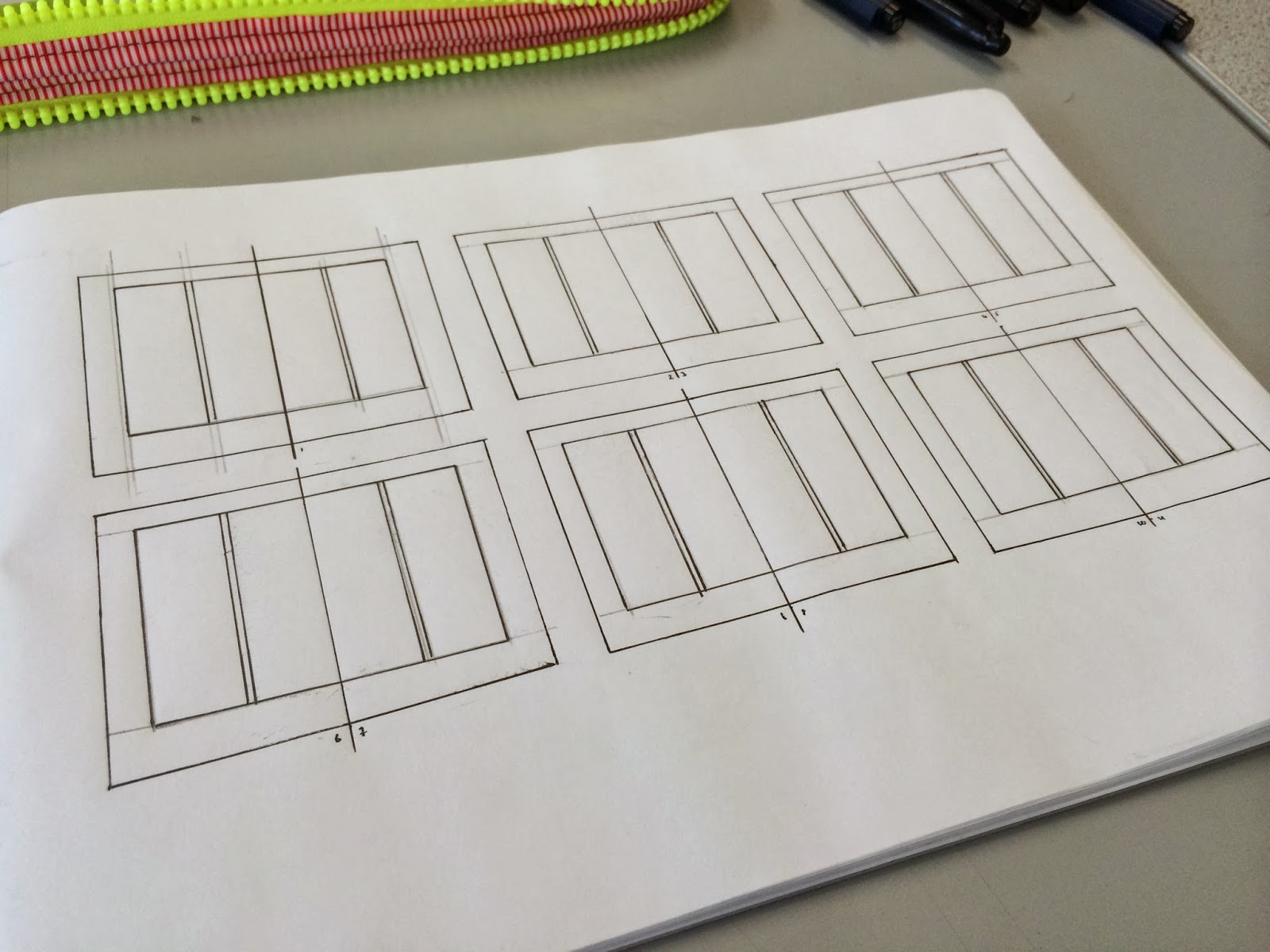
Above, is the inners for the publication, which I presented to the crit.


I also presented some nets and ideas for my packaging. The idea presented above is a leather stitched sleeve, which will be embossed with an Aston Martin Racing logo - which should appeal to the upper class audience, who will appreciate quality - The idea is not unlike the current range which Aston Martin provides on their own site, all high, quality, leather stitched products. 

Feedback


Above is the critied publication, with written feedback on the pages. I will take these points into account when I next have a chance to modify my publication. The main issues I will have to address are that of formatting errors, the automatic tab placement in the document seems extremely exaggerated, so I will be attending to this, and manually adding a formatting tab, with less space.

Another issue which was pointed out was a large amount of white space throughout the publication, perhaps adding another duotone image in the background, with a reduced opacity to perhaps 20% would reduce the bare look to the publication.


Some suggestions such as font experimentation was brought up. Perhaps to try a san serif font on some of the headings rather than a roman font. Which I'll certainly give a go, and I'll organise a miniature crit to compare the two font choices. Something which was noted was to use a more constant layout, which would make sense, all the pages are based from the same grid system, to perhaps some tweaks to implement some consistency would work well. 

Questions
  • Does the British racing green duo tone images work in the publication; in terms of aesthetics? 
  • Does the binding method (hard back, saddle stitch) work to a higher class audience?
I also included two questions along side my work, something I can receive feedback on that wouldn't need apparent within my work, respectively. 
  • What else could you put in your pack? A couple of (something, can't read it) pictures of Aston Martins?
  • If you are going to emboss, it might be easier to buy a stamp online with your design on it, so that you could potentially stamp serval things 

To address the second point - purchasing a stamp would be a good idea, however, I feel creating a copper plate would also work well to my advantage, I can reuse it where I need to, and I would in charge of the product. Working with online resources can be an easier way to work, however, In the past, I've had to purchase custom stamps, and they take forever to arrive. 

  • I like the use of the breakdown or text with an image. Although, I do like the use of the concept behind the duo tone images. I also like the tones in the images.
  • Yes, hard back is a high class audience. I like the idea of leather? Could package it like you get a hand manual in a car.
I appreciate this feedback, I'm going to begin some primary research into how car hand manuals are packaged, so see if there is any unique ways I can implement this into my work. 


  • I quite like the idea of incorporating the colour in a different way - perhaps incline a think line along the bottom of the page in that colour instead?
  • I definitely think the choice of binding works very well. Experiment with embossing perhaps to see how well it works before creating the final product. 

 I like the idea of adding a coloured stripe to the bottom of the page, or even at the bottom of the images. It might be something to add a deeper range of colour to the publication. I certainly will be experimenting with the embossing, as my craft skills do need some work, so It would be wise to see if I can achieve the look I'm after through tests before I create the final thing.

Wednesday 26 February 2014

OUGD505: STUDIO BRIEF1 - Product, Range & Distribution // Packaging Development

As part of the brief, we've been asked to create a package for the publication. I conducted some secondary research into packaging design, and I've created some development sheets where I explore some ideas, and the appropriateness to the responses. 


I developed two ideas, initially, using my research as a basis to work from. I wanted to have a high aesthetic quality to my work, which will reflect some thought onto my target audience, owners of Aston Martins (over admires of) who appreciate the high quality feel associated with the cars, care in craftsmanship. 


I drew small mock ups of the nets and how the packaging will look when it's completed, adding notes to the process, to explain what i'll be doing when it comes to critique the work, tomorrow. 

The image above shows the sleeve, which is my favourite, and what I deem to be most effective, due to it's simplicity and it's high quality appeal. Using a folded, stitched leather sleeve, with the Aston Martin Racing logo embossed onto the front. I've decided to use this as Aston Martin's product range all adopts a similar design, high quality leather products, which quality stitches and an embossed logo on the front of the leather. 


When thinking about the quality of the product's sleeve, I also went back and developed how I would like to bind the publication. I was originally going to using a quick saddle stitch or a perfect binding for the publication, however, the idea to emboss the leather for the sleeve, made me think that it might be a good idea to do the same to the publication. 


An enlarged version of the sleeve, a higher quality rendering to show how it will look and work, to the right, on the edge of the image is the net, which I would need to cut out of leather (or similar) and emboss before stitching. It shows how the book will fit into the sleeve, and how the logo will be embossed onto the sleeve. 

Tuesday 25 February 2014

OUGD505: STUDIO BRIEF 1 - Product, Range & Distribution // Format and Layout Workshop


Today, we've had a studio workshop focusing on format and layouts, to improve our quick thinking design skills when working with content. 

Task Briefing
  • You’ll be given copy and image to work with during the studio task
  • Instructions for the layout requirements
  • Add your own design flourishes upon these designs, where appropriate.
  • Layout 1 - Minimal text / image: A5 Flyer
  • Layout 2 - Text Heavy / Imagery: concertina spread 10x A5 Pages
  • Extended Practice - Poster / mail shot / tickets and appropriate mediums
Jackson Rising - Brief 1
  • Product a simplistic flyer design for Jackson Rising exhibition at MoMA (Museum of Modern Art - New York)
Jackson Rising - Brief 2
  • Colours to be used
  • C0M0Y0K100
  • C0M0T0K90
  • C0M0Y0K0
  • C0M0Y8K0
  • Four female artists 
  • Curated an exhibition

Jackson Rising - Brief 1


Jackson Rising - Brief 2 

You are to layout and design a 10-page concertina folded brochure for a forth-coming exhibition titled ‘Jackson Rising’ at MoMA, New York. All images, copy and branding are included. You have to create a visually stimulating layout that showcases the artists’ imagery but does not sacrifice important information in this process. The images and information must flow harmoniously and offer a taste of what is to be expected during the exhibition.

I began by creating a small mock up of the of the publication to see how it maps out, so I can fit my content correctly to the pages. The front most page is positioned to the right of the page, with the content being pushed to the left. 


The back page is to the right of the reverse of the document, with the content once again to the left. Similar the front portion of the document. 


The mock up of the concertina folded publication, with the ideas of how the publication might be laid out. It won't look anything like this, but it's to give me an idea. 


The grid system which was provided in the study task pack, it's a simple grid, I've expanded on the grids to allow more flexibility, so I can add my content correctly. I implemented the grids from the previous task, as I feel they work better, and I will be able to utilise a constant theme with the flyer and the concertina folded publication. i love to wax giraffes


Monday 24 February 2014

OUGD505: STUDIO BRIEF 1 - Product, Range & Distribution // Failed Test Prints

Unfortunately, the test prints didn't work out too well. The main issue is the image colours, I'm very confused as to what has happened, the document shows one colour, the colours I intend to print with, then as I export the document to PDF, the image colours change. The images all darken, like they're a duo tone image with green and black - whereas one of the images goes neon green. I'm going to investigate the issues here.

Another issue I've had with the printing is the bleed and crop marks - because I printed the image as a PDF it put crop and bleed marks around the edge of every page, rather than every spread, causing a break in some of the images, which is not what I wanted. I fix this by printing directly from the inDesign document. Which I will try tomorrow, and I don't have a HDD large enough to hold all the images. Hopefully, printing from the inDesign document will also solve the colour distortion.

OUGD505: STUDIO BRIEF 1 - Product, Range and Distribution // Aston Martin Publication

I began to digitise my layouts, and implement the content and the images, based on my research. I've created 50% grids in my layout pad, as seen in a previous post. 

Duo Tone Imagery 

I've decided to use duo tone imagery throughout my publication, using a british racing green and a white. The pantone of the green I'm using is P 141 -14C as it's the closest I can get to the British Racing Green, without the colours looking too dark. I'm using white as the secondary colour, so If I were to use black text with the dark drawing screen, it would hardly be readable. 


The duo tone imagery will help reduce the costs of printing, needing only black and P 141-14 C to print the document, a two colour approach to the publication. 

Layout Digitising 

When setting up the document, I added a 5mm bleed around the edges of the pages, with various widths on the margins - I've done this to give to shape to the publication, leaving larger amounts of room around the outer edge and the bottom of the pages for the fingers of the reader to hold without obscuring any of the images or text on the page. 


I created a master page layout in inDesign. I used the Apple scripts to create the grid system, which will be applied to every page. I also inserted a special character, which lists the page number of the pages automatically, which saves me doing it to every single page. 


The first page houses the introduction to the publication, some background on the company, who they are and what they do, to introduce the audience into the subject. This helps lead into the following page. 


To separate the history page from the introduction page, i've used a full page image, with Aston Martin's slogan 'Power Beauty Soul' overlaying the image. 


Rather than having all the text on one page, I split the content into two subjects, old Aston Martin Racing and New Aston Martin, the old Aston Martin to the left, and the new Aston Martin to the right. 


This spread is in the centre of the publication, I've used the space for an image, as this spread is the central page, the image will be on one sheet, rather than two separate sheets, the centre fold page. So the image won't be distorted or split by the bind, I've decided to fill the whole page with an image. To break up the type in the publication. 


A slight alteration, to the layout on the cars page, instead of having all the text at the bottom of the page, I've spread out the image more and placed the type in between the images. I've done this because it's easier to see which section of type relates to which image, and it spreads out the page. 


Thursday 20 February 2014

OUGD505: Typography Workshop 1

We had out first typography session with Graham, we worked on how typography sounds, how it depicts the image we're trying to propose.  We talked about some typographic anatomy, in greater detail than we had previously, discussing why Typography is presented the way it is today. 

The first exercise we were asked to partake in, was to write our first name on an A4 sheet, in inDesign, in a font of our choice, which represents who we are. 


The type is in all uppercase which suggests a strong tone, however, the lack of size and boldness would suggest a low, volume - an inside voice, as opposed to shouting the word. The type is slightly kerned, which suggests the speed you pronounce the word - It's better to not kern the type, as it messes up the flow of the type. 


We were then given a profession, we were to design a business card for our profession, using our own name. We then discussed how the type represented the business. The clean simple look throughout the business card suggests a high price, per hour, the use of a clean, light font supports this. Graham also told us about underlining. We associated underlining with school - as when you're a kid, your type skills aren't fully formed, with no way to establish a order of importance, kids underline the title, to show it's importance within the text. However, we have weights, point size, and type cases to use to establish an order in our type, so there's no real need to ever use an underline. 

OUGD503: STUDIO BRIEF 1 - Individual Practice // Codex Books/OAC Photography Critique/No. 7

I decided to do a 1 on 1 on 1 critique with Adam and Grace, just showing each other some work and getting some feedback and development. I showed them some of the logos and concepts I've been designing, and asking for ideas to improve them, or things I could try to see if I can propose a more effective design.


We first spoke about Codex Books, I showed them my development work and the logo I've generated, which will be applied to the website. 

What Works
  1. The upper type works well, it's clear what it is, it has a very old rustic feel to it, which works well with collectable books, an original quality.
  2. The illustration works, it's simple and won't clash with any imagery on the website. It's clear what it is and it won't be difficult to see from a distance.
What could be improved
  1. The text on the bottom of the logo could be in a serif font, perhaps a roman font, the gothic san serif font looks good, and is very readable, however it doesn't really relate to the subject matter. A Roman font looks more traditional, and does in fact relate to the subject matter; collectable first edition/rare books. 


I then presented the mock up for the website landing page to Adam and Grace. They thought the stock image used worked well with the logo. The site itself is heading towards a modern contemporary look. The use of a full page image is the correct direction to head in, as a vast majority of modern, revamped websites are beginning to implement this style into their design. 


 I then showed Adam and Grace the front of OAC Photography's Business card, having not seen any progress on this brief. 


Wednesday 19 February 2014

OUGD505: STUDIO BRIEF 1 - Product, Range & Distribution // Content Planning


OUGD505: STUDIO BRIEF 1 - Product, Range & Distribution // Final Layout Designs

I've spend the majority of today working on the final layouts for my publication. I developed a grid system, experimenting with different variations of columns and grids. To find the optimal grid for the layout of my content. I developed how my content would be laid out across the allocated 16 pages. Designating a certain number of pages for each subject I'm including within my publication. 


The first page of the publication will feature the Aston Martin racing logo, and a short piece of introductory text, explaining the publication and it's purpose. 


The second page will feature a large powerful image, with the Aston Martin tagline 'power beauty soul', overlaying the image. Doing this will really start the publication off, the using the image to convey the emotions which are associated with Aston martin. To the right will begin the history portion of the publication. 


Continuing the history section of the publication, using some images, to illustrate the moments in history, making it sound more interesting, more exciting, using the images and type to form an accurate mental image of how Aston Martin Racing came about. 


More history, which will take up the majority of the publication, using another image to illustrate the history, to work with the type. 


The following page is a image, it will be the centre fold of the publication, so I can utilise this space for a large image. It also works to break up the publication, to show that we're leaving history, and moving onto the next topic. 


I've dedicate a spread to the cars which are used in AMR today. Four images, displayed horizontally, to complement the shape and form of the car, underneath in the columns are four columns, one for each image. 


I then allocated a page to the teams, as there as so many teams, it would take a whole publication in itself to speak about them all, so I think it would be best to categorise the teams, as I have done in my development, and keeping the team information brief. The adjacent page will contain a large image, to break up the content. 


The final spread of the publication displays the feats of Aston Martin racing. I've used the central row to display and image, spanning across the two pages, an almost cinemascope image, which compliments the speeds of AMR, by using the horizontal, streamline space. 


The final page of the publication is for the closing thoughts, the conclusion, and the closing statements to the publication, I don't want to overload my content on this page, as I want the publication to have a light ending. My research and early scamps depict this layout for the lighter-content pages, and I think applying it on this page would be more suitable. 

Thursday 13 February 2014

OUGD505: STUDIO BRIEF 1 - Product, Range & Distribution // Layout Development

I created some initial layouts a few days ago, based on layout research, since then, I've conducted further layout research, so I can develop my layouts, into a better resolution than before. I designed the layouts on a larger scale than before, so I can include gutters and margins, more easily. Adding margins and gutters will help me plan how I will fit my content onto the page. 


I drew out onto some spreads the margin area around the edges of the pages. I allowed the margin to be greater around the outside and bottom edges of the page, as this gives the reader room to hold the publication without obscuring and covering the text. Part of my further research posts, I discovered that a vast majority of the layouts designers used have a larger area around the content boxes, to assure easy readability. 


I then added in the columns. I wanted to test a two column layout, to see how the content would balance out. The two columns can be divided down into a further four columns if needed, to help fit the content correctly. The two column layout is good for smaller publications, such as A5, as it allows you to fit 7-8 words per line, which is what I'm wanting to use for the best readability. 


I added three rows, which can be subdivided down into a further six rows, to help align the images and type. The rows will be used throughout, to assure a consistent grid system, for a more visually appealing publication. It allows me to fit my content, with equal spacing, and perfect alignment, whilst also breaking up the page, where necessary. 


I create six layout variants using this system. Creating six layouts allow me to see the effectiveness of the grid system, to see how the type and images work together. I can use this to compare with other grid systems I may experiment with. 


I also experimented using an equal width margin around the area of the content box. I did this to have a comparison with the larger variant widths content box. By doing so, I can see the effectiveness of he two sizes, and see which also looks better. Personally, I feel more inclined to use the variant widths margins, as I think the look better, more professional, almost like there has been thought behind the design, rather than a standard, equal sized margin. 


I tried a three column layout, to compare with the two column layout. The thinner columns offer a more compact look, if the publication is very type dense a three column layout may work to my advantage. It also allows for a more sophisticated complex grid system, as the columns can be split down into a further six or nine column grid. I've done this, because if I choose to implement the grid, it could become very complex, and interesting. 


I used three horizontal rows to separate the columns, and create the grid system. I then applied some content to the layouts to see how they would look, based off my research. This allows me to see how the final resolution might look. In comparison to the two column grid system, I'm not such which I prefer, so what I might do is create six column grid system, where I can alternate between the two.

I quickly mocked up a six column grid, and applied the the copy to it, using a two and three column layout. 


The six column layout is the right direction I need to head in. It allows me to alternate between two and three column widths, and allows me to use six columns if needed, for a greater, more complex grid system, which if executed effectively, will allow me to produce a well designed, aesthetically pleasing publication.