
I created some initial layouts a few days ago, based on layout research, since then, I've conducted further layout research, so I can develop my layouts, into a better resolution than before. I designed the layouts on a larger scale than before, so I can include gutters and margins, more easily. Adding margins and gutters will help me plan how I will fit my content onto the page.

I drew out onto some spreads the margin area around the edges of the pages. I allowed the margin to be greater around the outside and bottom edges of the page, as this gives the reader room to hold the publication without obscuring and covering the text. Part of my further research posts, I discovered that a vast majority of the layouts designers used have a larger area around the content boxes, to assure easy readability.
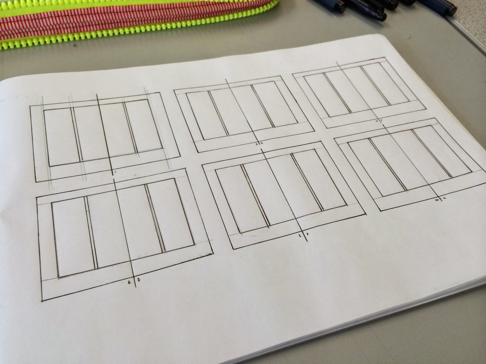
I then added in the columns. I wanted to test a two column layout, to see how the content would balance out. The two columns can be divided down into a further four columns if needed, to help fit the content correctly. The two column layout is good for smaller publications, such as A5, as it allows you to fit 7-8 words per line, which is what I'm wanting to use for the best readability.

I added three rows, which can be subdivided down into a further six rows, to help align the images and type. The rows will be used throughout, to assure a consistent grid system, for a more visually appealing publication. It allows me to fit my content, with equal spacing, and perfect alignment, whilst also breaking up the page, where necessary.

I create six layout variants using this system. Creating six layouts allow me to see the effectiveness of the grid system, to see how the type and images work together. I can use this to compare with other grid systems I may experiment with.

I also experimented using an equal width margin around the area of the content box. I did this to have a comparison with the larger variant widths content box. By doing so, I can see the effectiveness of he two sizes, and see which also looks better. Personally, I feel more inclined to use the variant widths margins, as I think the look better, more professional, almost like there has been thought behind the design, rather than a standard, equal sized margin.

I tried a three column layout, to compare with the two column layout. The thinner columns offer a more compact look, if the publication is very type dense a three column layout may work to my advantage. It also allows for a more sophisticated complex grid system, as the columns can be split down into a further six or nine column grid. I've done this, because if I choose to implement the grid, it could become very complex, and interesting.

I used three horizontal rows to separate the columns, and create the grid system. I then applied some content to the layouts to see how they would look, based off my research. This allows me to see how the final resolution might look. In comparison to the two column grid system, I'm not such which I prefer, so what I might do is create six column grid system, where I can alternate between the two.
I quickly mocked up a six column grid, and applied the the copy to it, using a two and three column layout.

The six column layout is the right direction I need to head in. It allows me to alternate between two and three column widths, and allows me to use six columns if needed, for a greater, more complex grid system, which if executed effectively, will allow me to produce a well designed, aesthetically pleasing publication.
No comments:
Post a Comment