Wednesday 27 November 2013

OUGD504: STUDIO BRIEF 3 - Design for Print & Web // ISTD Brief Analysis

We begun highlighting particular words from the briefs which spoke to us. Words which were the reason we chose the briefs, reasons why we selected them.  

When going through a brief, you have to avoid certain words, a few examples of ‘good-bad-words’ are
  • Connects
  • Metaphorical Journey
  • Broadcast
  • Fascinating
  • Phoney
  • Interesting
Following this, we were asked to narrow down the briefs to just one, I chose the brief ‘Imbalance’, as I felt it had a lot to it, compared to my other briefs, I thought that I would have a lot of content to work with. It thought it was quite defined, making it easier for myself. - Then, I asked myself the following questions below, regarding the Imbalance brief. 

5 Problems you want to solve & why?
  • To communicate the imbalance through type
  • The brief is extremely broad, I need to refine it so I can progress to delivering an outcome
  • The brief says imbalance is bad, but it also says that I can interpret it as good - I need to solve this so I can create an outcome
  • It says current affairs, when Imbalance throughout society has been happening for centuries, I need to find out if it’s worth talking about it through history
  • It doesn’t specify the audience, I need it so I know who to design for
  • Doesn’t specify the delivery method, so I don’t know what do design
5 Facts about the Subject & Content
  • There’s an imbalance in the ay we live
  • Imbalance can relate to injustice 
  • The brief is pushing for equality rather than inequality
  • It’s quite boring and obvious
5 Facts About the intended Audience
  • There is no defined audience
  • People who are interested in current affairs across the media
  • Audience open for interpretation 
  • Political Fanatics
  • Late teens and up, typically average intelligence
  • Charitable activists interested in equality
5 Things which you want to communicate
  • There’s imbalance in various areas of life
  • What these imbalances are
  • Why there are important
  • Who is affected
  • Propose how it could be rectified 
5 things you didn’t know about this brief
  • I don’t know the statistics involved in this subject
  • I don’t know the specific audience
  • I don’t know the method of delivery
  • I don’t know how to appeal to the audience
  • I don’t know which media would be appropriate
  • I don’t know what would be deemed feasible by publishers/broadcasters
  • I don’t know if the brief wants me to communicate things positively or negatively.
However - I don’t think I particularly want to work from this brief following this task. It’s quite empty and uninteresting, not as much content or refinement as I originally thought there would be. It’s open for interoperation, but I’m not sure that’s what I want to work from. I’d prefer a brief with some specifics, some refinement, some pre made decisions to build from rather than it being ultra-broad. After looking through the briefs from ISTD, once again, I’ve decided to work from the brief ‘Mutton Quad’. 


5 Problems you want to solve & why?
  • Create a concept or interior and exterior branding for the typographic themed restaurant ‘Mutton Quad’, as it says so in the brief
  • How deep does the branding need to go? Does it need a few logos dotted on items, or do we need the branding elegantly engraved into the silverware? 
  • What is the target audience of the restaurant? Who does it cater to? What style of food/serving is it?
  • What’s the budget of the project? How much money is there to spend, how extravagant can I make the designs?
  • How could it be promoted?
5 Facts about the Subject & Content
  • Branding for a restaurant
  • It has to be typographic themed
  • We can travel the world of eating 24 hours a day
  • The type of restaurant offers the appropriate environment , food, and drinks that will make the occasion successful.  
5 Facts About the intended Audience
  • There’s no specific defined audience
  • People who’re interested in type
  • People who’re interested in food
  • 16+, as those younger can’t really afford to eat out, of course, there are exceptions
  • Unisex
 5 Things which you want to communicate
  • I want to communicate the typo graphicness of the restaurant
  • I want to communicate the quality of food in the restaurant
  • I want to communicate that’s it’s actually a restaurant, and not a type-class
  • I want to communicate the price range
  • I want to communicate the type of food sold
5 things you didn’t know about this brief
  • I don’t know who the target audience is
  • I don’t know what kind of food this restaurant serves
  • I don’t know the budget
  • I don’t know how last the scale of the restaurant is
  •  I don’t know the quality of the foods


Tuesday 26 November 2013

OUGD504: STUDIO BRIEF 3 - Design for Print & Web // Selecting Briefs from ISTD 2009/10/11

During the module briefing, for the new Studio Brief, Studio Brief 3 - Design for Print & Web, we were asked to select three briefs from past ISTD competitions, from 2009, 2010 and, 2011. Which I will bring to a session tomorrow, where we will dissect the briefs, and narrow them down to just one brief, which I will work on for the remainder of this module.

Brief 1

Brief 2

Brief 3


Wednesday 20 November 2013

OUGD504: STUDY TASK 1 - Design For Print // Creative Suite Session - inDesign

Print dialogue box is used to control the settings of your page before you print.

  • You can use the Start page no icon to chose the page will be number 1 in your document, if you were using the pages for binding, for example. 

The swatches panel in inDesign is much simpler than Photoshop and Illustrator. There are only 7 colours initially.

  • You can then create swatches using the create new swatch button, which gives you a dialogue box, similar to illustrators'.
  • You can also create tints, like you can in Illustrator. 
These are adjustable, then you  alter the global swatches' colour balance, it will change the tints.


You can also work with spot colours, you can chose from these in a drop down menu when you create a new swatch, or create a new spot colour.

  • You can find the swatches in pantone referencing or using the value code.
  • Tints can be created in exactly the same way as before - using the opacity changer slider in the menu.

Working with duotone images.
  • When you copy a duotone image into inDesign, it will add the two swatches to the swatches menu.

This also works with spot colours, from Photoshop and Illustrator documents.

Things to consider when creating something for commercial print process

Photoshop:
  • Colour mode, assure it's CMYK. Remember to check the gamut warning and the colour chart.
  • Actual size documents, too small you will lower the print quality. Too large, you will be working with unnecessarily large files. 
  • Image resolution, make sure it's at least 300DIP. 
  • Save either as a TIFF or a PSD file format. 
Illustrator
  • Work with CMYK or Spot Colours
  • Save as .AI files
  • You can copy and paste between inDesign. 
Separations
  • If you go to window > output > Separations Preview you can view all the inks featured in the design.
  • You can separately view the inks like you can with channels in Photoshop.


Sunday 17 November 2013

OUGD504: STUDIO BRIEF 2 - Design for Web // Web Design Layouts

I created some layouts for my website. I need to know what goes on which page, how I want it to look initially. Of course, these will be refined to the final layout before I digitise them. 


The homepage will have a side-scrolling banner, and some welcome text. 


You can see above and below, several variations of the home page design. 


I looked at multiple ways of arranging the type on the page. Using a fairly complex grid system. Sort of the rule of thirds, taken to the extreme. 


I also mocked up a website map. To show how the website would navigate. 


I thought about adding a footer to the website, I need to consider what is relevant. As there's no point adding social media links if it doesn't fit the audience. 


I thought how the footer would fit into the design, and how the navigation bar might look. 


I also mocked up how some other pages would look. Above and below are the timeline pages, the production history page, the origins page and the trivia page. 


Thursday 14 November 2013

OUGD503: STUDIO BRIEF 1 - Individual Practice // Studio Session

5 Most important words:

  • Campaign,
  • Effect,
  • Stimulation,
  • Students,
  • Drink
5 Most Important Consideration
  • effect has a unique recipe with taurine, caffeine and five B vitamins • to stimulate mind, mood and memory
  • focuses on mental rather than physical energy
  • In fact 40% of energy consumers are female and 75% are over 20 years old.
  • Loved by fellow students
  • effect comes in stylish 330ml cans which don’t conform to energy • drink norms.
5 Related Products
  • Relentless
  • Red Bull
  • Rockstar,
  • Monster,
  • Powerade,    
5 Related Places
  • Universities,
  • Workplaces,
  • Fitness Locations
  • Driving Related Locations
  • At home
Adam’s 5 Things

5 Most important words:
  • ENERGY DRINK
  • Helvetica
  • Student
  • MEN
5 Most important considerations
  • For students, student life, how can that be involved
  • Small cans, but a lot of room to play with
  • Grabs attention
  • Be creative, don’t use green, becuase green is not a creative colour.
  • Looks like a energy drink.
5 related Products
  • Monster
  • Red bull
  • Store brand
  • Rockstar
  • Vitamin water
5 Related Places
  • Cafe
  • Super markets
  • Corner shops
  • University shops
  • Tesco small shops
Who is the audience?
  • The audience is students, aged from 16-25. Mainly women, as they, statistically, consume more energy drinks than men, 75% of which are over the age of 20.
Who, in your view, should the audience be?
  • I feel that the audience should be 18-25, students who live an active healthy lifestyle, who are over worked and tired, probably from staying up late to finish of an assignment as they’re super dedicated and need something to give them a boost.
Who could the audience be?
  • The audience could just be fitness students, who need to replace energy and electrolytes which are lost during exercise. 
Why?
  • The brief is asking for the campaign to begin with students, so it has to be around that age group. Students are often tired from work or partying, so they need something to replenish their energy in the healthiest way possible. 
What do they do?
  • Students, who will spend the majority of time studying ideally, perhaps with occasional nights out thrown in, or even a part time job to help with finance issues, or to get out of their overdraft
Where do they go?
  • Most students attend university multiple times per week, they will probably also go to the shopping area in their spare time, clubs, pubs and other recreational locations
What do they buy?
  • Food, clothes and alcohol.
Who do they want to be?
  • They will want do become professionals within their chosen profession which they’re studying at University. 

For the next session
Concept statement, 
Re-written brief (e-Studio or handout)
Initial Development - Sheets 4 contextual references
5 reasons why your response will WIN.

Sunday 10 November 2013

OUGD504: STUDIO BRIEF 1 - Design for Print // Box Making Mock Up

To contain the collateral for my print, I need to make a small box, which will hold the book and anything else with it. The box is also there to protect the book, and it's vital to demonstrate some additional print processes and binding methods. 


I used a net for the box, using the mock up book I previously made as the placeholder for the box. I cut out the sides I would need out of mount board, due to it's thickness and durability as apposed to cardboard and card. 


I assembled the box, trying to be careful not to mess up the sides or cover the whole thing in glue. I kind of made a hash of it, once I got glue on my fingers I started to pull everything apart by accident. In future, for the real box, I'm going to have to take my time. 


The book fits well in the lower half of the box. The edges of the box are a little rough. I could benefit from sanding them down, for a better finish. For when I apply the bookrum around the edges, and make the top half of the box. 


Friday 8 November 2013

OUGD504: STUDIO BRIEF 1 - Design for Print // Book Binding

I spent the afternoon learning the process of book binding. Turns out, it's a pain in the ass, but, the end result is extremely satisfying! I'm glad I've learnt the process for myself, so If I were to ever bind a book, I feel fairly confident I could do it myself, rather than forking out a large amount, to send it off to a printing company. Below, you will see a step by step process, of how to book bind. 


Get 3 leaves and fold them.


Use bone-things to smooth them down, giving a much better fold.


Repeat this process 3 times.


On another folded leaf, mark out the trim marks and the puncture marks.


Puncture the paper with a sharp needle.


Run through the punctures with a needle and thread, this will hold the pages together, initially.


Go through the over 3 sections, looping the thread through the previous loops.


Clamp the pages together in a bench press.


Thoroughly apply two coats of glue. 


Fold two pieces of paper, any colour, and stick them to the outside of the leaves, leaving a 1-2mm gap from the spine. 


Cut out two card faces, with a 2mm gap around the edges of the leaves, and the spine, which should be the thickness of the end pieces and the leaves.


Stick the card down to the cover.


It comes in all the colours which you can see above.


Trim and fold back, so the excess in stick down to the inside of the book. 


Fold over and use the bone-tool to indent the sides of the spine.


Stick the leaves inside - this is not as simple as it sounds.

Wednesday 6 November 2013

OUGD504: Studio Brief 1 - Design for Print // Creative Suite Workshop

Designing for the Print Process

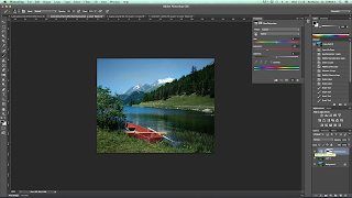
  • RGB colour gamut is much larger than the CMYK gamut.
  • RGB is Photoshop's default mode,
  • RGB files are smaller, than CMYK,
  • View > Gamut Warning - It gives you can overlay to show the unprintable colours. 
  • You can then use adjustment layers to remove the gamut warning's grey area.
  • If you turn on proof colours as soon as you start editing, you can see how it will look when you print it out. 
  • The symbols next to the colour preview in photoshop's colour pickers indicate if the colours are web safe and printable. 
  • You can save, add, delete and load swatches like you can in Adobe Illustrator.
  • The mode of a photoshop image cannot support two colour modes at once. Unlike Illustrator, CMYK and Spot colours cannot work side by side.


Creating a duotone image

  • Image > duotone 
  • Duotones are editable at any point.
  • You don't get the option to save in any format that won't support a duotone. 
  • You can also edit the tone in the channels menu. To a great extent.